As we kick off 2025, Clarity’s been hard at work bringing you fresh features to help you better understand and optimize your website’s user experience. Let’s dive into the key updates from January, with some exciting new tools to make your insights even sharper!
1. Attention Maps – Get the Full Picture
Wonder where your users are focusing on your page? With Attention Maps, you can now visualize exactly where their eyes are landing. This new feature helps you identify the hot spots on your site, so you can optimize content placement and improve user engagement.
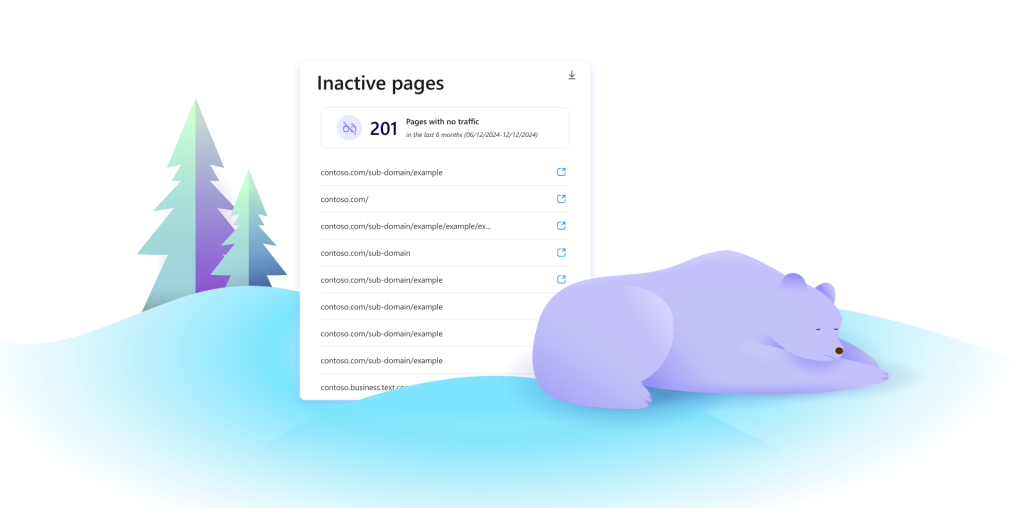
2. Inactive Pages – Identify and Improve
Do you have pages that aren’t getting enough love? With the Inactive Pages feature, you can pinpoint pages on your site that aren’t performing well in terms of user interaction. This enables you to focus your efforts on optimizing underperforming content.
3. Google Ads Integration – Measure and Optimize Campaigns
Now you can easily track and assess the performance of your Google Ads campaigns directly in Clarity. The new Google Ads Integration provides valuable insights to help you measure how your ads are driving user behavior on your website.
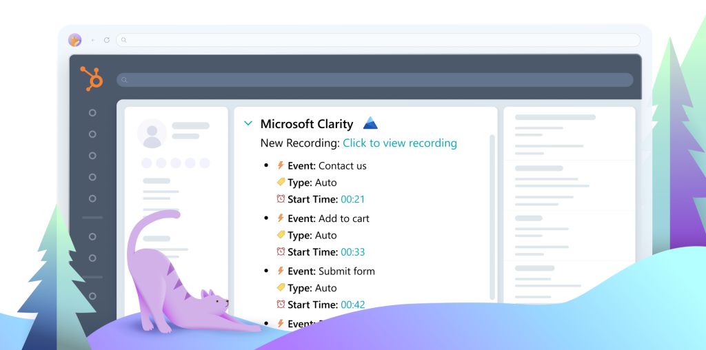
4. HubSpot Integration – Smarter Event Tracking
Clarity’s integration with HubSpot brings powerful tracking capabilities right to your fingertips. With Smart Events, you can track key user interactions and sync them with your HubSpot account for enhanced CRM insights.
5. Performance Metric (INP) – Improve User Experience
User experience is key, and with the new Performance Metric (INP), you can better measure how quickly users can interact with your site. This metric helps you identify and address performance bottlenecks, making your site feel faster and more responsive.
Stay ahead with these tools and keep an eye out for more updates in the coming months!
In the meantime, follow us on X, IG, LinkedIn and YouTube so you don’t miss anything!
Protected: Elevate Your Website: The Top 10 Keywords Driving Clicks for 2024
Ever wish you could read the minds of your website visitors, know how they use your site, and figure out what really makes them convert?
While that dream isn’t yet reality, Microsoft Clarity’s heat mapping tool offers one of the closest technologies yet to help you achieve this goal.
It lets you visualize data so you can better understand how visitors interact and behave on your site.
Yet, while heatmapping data can paint a rich and colorful picture of what visitors engage with on your site, and what they might be missing, it doesn’t show the full story.
To really understand what your users are doing, you need to watch them.
Step in session replays.
What are session replays, and why are they important?
Session replays are video recordings of each individual user’s web session.
The recordings reveal how your actual web visitors are navigating your website and interacting with the elements on your pages.
Through watching session replays, it’s like you can step into the minds of your users and witness their every click, scroll, and interaction.
But the recordings can offer more than just a glimpse into the virtual footsteps of your audience. They can be the key to unlocking a treasure trove of insights to users and how they behavior on your site.
How do users interact with an onboarding sequence?
By asking yourself these same questions, and evaluating the session reply data, you can extract valuable insights that let plug leaks and reduce the friction in your conversion funnel.
The problem with session replays
While session replays add incredible arsenal to an experimenter’s toolkit, they do have a drawback: they’re extremely time consuming to take in.
Even though you can play them back at 12X speed, and filter the playbacks to monitor only specific visitor actions, it can still take hours or days to get through each video replay.
One-by-one, you need to watch mouse movements, observe button clicks, make mental notes, write down observations, and formulate trends.
The process is both tedious and mentally taxing!
It seems there’s got to be a better way. . .
AI-generated insights in a flash
Imagine being able to harness AI to effortlessly generate session replay summaries?
By using AI-driven algorithms, Copilot identifies user patterns, frustrations, and engagement highs and lows.
Copilot’s natural language summaries distill complex session data into concise, actionable takeaways, eliminating the need to sift through hours of recordings.
Using Copilot is equally as easy as generating robust insights from it.
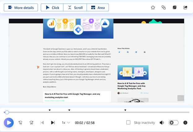
Within Microsoft Clarity, simply click on the Recordings tab, then go to the left side of the screen, where All recordings are listed. Then, go into any single recording and hit the plus talk bubble icon:
Within seconds, Copilot – which is integrated with ChatGTP – will immediately create a detailed summary of the actions the user took, hitting all the key points.
In an instant, you’re given everything needed to understand how the user behaved and why. Your bullet point summary will looking something like this:
Which means that, within seconds – not hours or days – you’re now able to make informed data-driven decisions without needing to decipher reams of intricate data.
So you can say goodbye to labor-intensive manual analysis and welcome a new era of efficient, time-saving optimization.
Data you can trust, literally
While Copilot pushes the boundaries of innovation, you can also rest easy knowing that the data it provides is truly trustworthy.
Like all of Microsoft Clarity, Copilot is built within a framework of trust and security. The data you’ll get is both GDPR and CCPA compliant.
This data protection ensures your session replay, and AI-generated insights, are not only productive but also ethically sound.
Using Clarity’s Copilot tool to enhance your productivity
Microsoft Clarity’s Copilot isn’t just a tool; it’s a game-changing addition to heatmapping optimization.
By leveraging AI-generated session insights, you’re not only saving yourself the tedious, time-consuming task of combing through mounds of session replays, you’re also optimizing your optimization process!
Deborah O’Malley is a top A/B testing influencer and recognized as a leading women CRO specialist.
She’s the founder of GuessTheTest, an experimentation resource dedicated to sharing A/B test case study knowledge and insights. Turing theory into practice, she runs the optimization agency, ConvertExperts, where she helps clients test and optimize their sites.
A published author of six peer-reviewed journal articles, Deborah also teaches analytics at Queen’s University’s prestigious business school.
When not out speaking about experimentation, Deborah can be found in the kitchen making homemade fudge or burning it off at the gym.
If you’re ready to streamline your data analysis and boost productivity, then you’ve come to the right place! In this guide, we’ll dive into the ins and outs of Copilot in Clarity -empowering you to navigate the features with ease and confidence.
A bit of context
To understand our Copilot features, it helps to understand first what Microsoft Clarity is.
If you’re new to Microsoft Clarity, welcome! We are a free behavioral analytics tool, helping you optimize your website by understanding your site visitors. What journey do they follow on your site? What parts do they love? What pages do they have trouble on? We offer session recordings, heatmaps and insights to help you understand pain points and opportunities. Did we mention we’re free?
Introduction to Copilot in Clarity
To make data analysis easier and faster for you, we’ve built a suite of Copilot features to help you skip directly to the important info. These features all incorporate generative AI through Large Language Models (LLMs), the same technology that underpins ChatGPT. Let’s check them out!
1. Chat with Copilot
Copilot helps you better understand your project data. Using Generative AI, Copilot provides instant, easy-to-understand answers to your dashboard questions. Simply click the icon in the top right to get started!
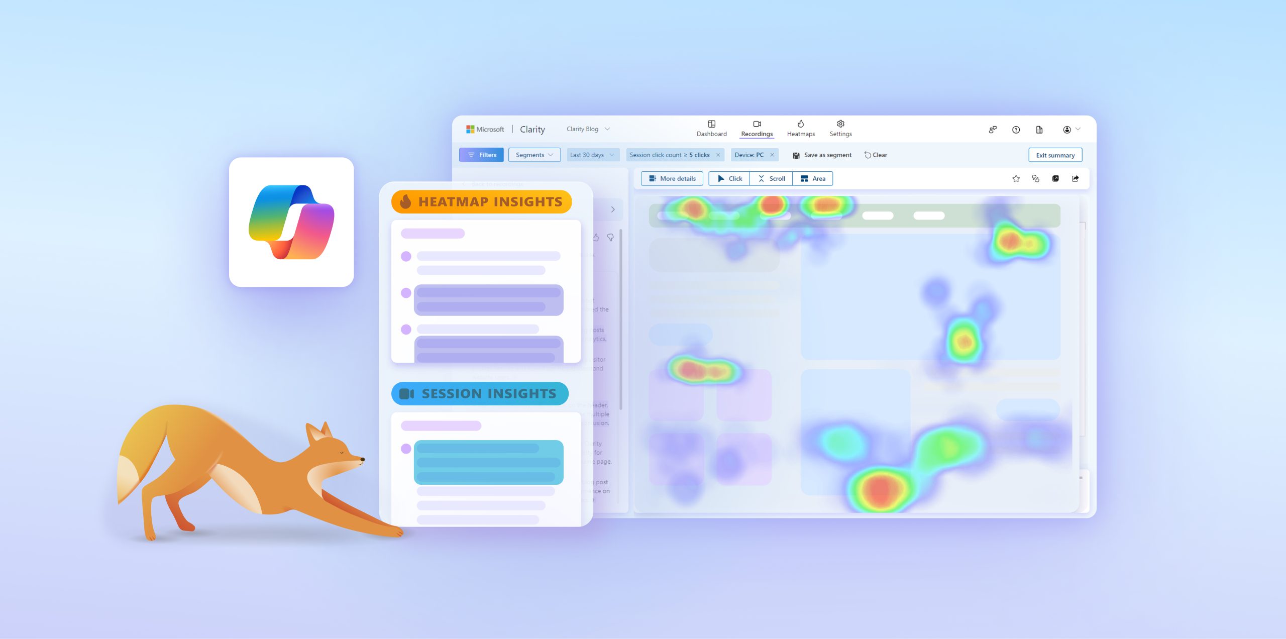
2. Session Insights
Session insights, powered by Copilot, quickly summarize session recordings for you. Instead of manually watching countless long recordings, just use Session insights to understand the recording within seconds.
To use it, simply click on the Summarize icon in the individual recording:
For more information, visit our documentation here.
3. Grouped Session insights
Our next Copilot-powered feature is Grouped Session insights, which summarize multiple session recordings at a time. This feature allows you to extract key patterns at a glance and pinpoint the recordings that are worth watching.
To use it, simply click on the Summarize icon on the top right of the Recordings panel. Pro tip: if you have a specific segment of users you’d like to summarize, filter to that group first and select the “Top 10 recordings” option.
For more information, visit our documentation here.
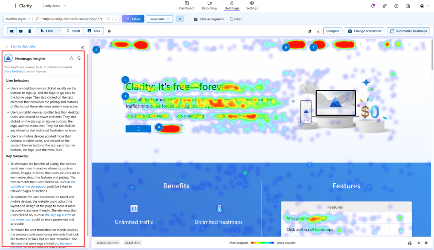
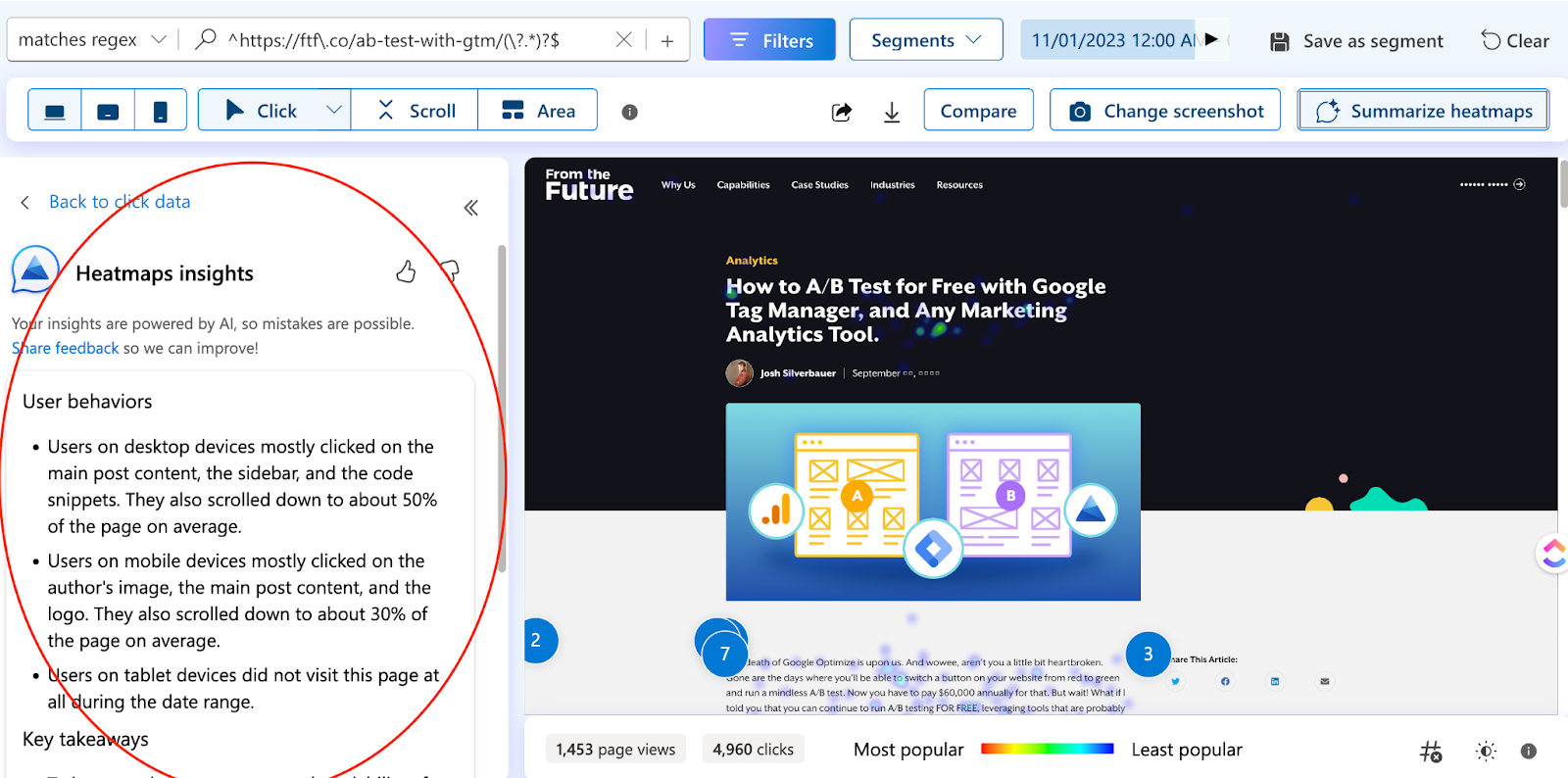
4. Heatmap insights
Heatmap insights allow you to summarize across multiple heatmaps for a website page. In other words, given a page URL, Copilot parses through the click and scroll heatmaps across all three devices for that URL and outputs a descriptive summary. This means you get a more complete understanding of the aggregated user behavior of a website page in seconds.
To use it, simply click on the Summarize button in the top right corner of the Heatmaps tab.
For more information, view the documentation here.
Conclusion
Our mission with Clarity is to make behavioral analytics more accessible for everyone, even non-technical folks. When we roll out Copilot features, our aim is to make the latest generative AI technologies available for everyone and contribute to faster, easier analytics. Stay tuned as we roll out more Copilot features in the coming weeks!
If you have feedback to share on this guide or our Copilot features, tweet us @msftclarity or contact our Support team. We’d love to hear from you!
Unlocking Ecommerce Success: 10 Strategies to Boost Purchases with Behavior Analytics
I’m going to ask an easy question. What’s the point of an online store?
Well, on the surface, there’s a simple answer: to sell products. But underneath that statement, there’s a whole world of complexity that comes with the second goal of “providing a positive experience for your customers.” There are countless touch points along the way that could prevent people from purchasing from your online store. Imagine you have a physical store, and when a customer comes in to buy some cheese, they find that the cheese is on the top shelf, and they need a ladder to climb up and get to it. Sounds like that person is not going to buy that cheese, right? Maybe 1 in 30 will find an employee and ask for a ladder, but most likely, that person is going home without cheese. On the web, there are so many friction points that prevent users from having a positive experience and buying your cheese (or whatever you sell). The good news? There are amazing tools out there that provide insights into these friction areas, so that you can identify and ultimately solve many of the issues that are preventing users from purchasing.
And that’s what we are going to talk about today. Here are 10 strategies on how to use behavior analytics to enhance a user’s experience on your online store and, therefore, optimize your sales.
Utilize Heatmaps to Understand What People See and What They Don’t
In your imaginary physical store, would you put some awesome product information in the very back? Probably not. Companies invest a LOT of time into content and specific elements on their site, assuming that these will help provide information or interaction to increase the likelihood of conversion. The problem is that oftentimes, people don’t see a lot of it. While every website is different, there is generally a drop-off effect the further down your content is on the page. Imagine someone having to scroll to get a look at your products; you can bet that there will be significantly fewer clicks to cart compared to if that person saw the product right away. To understand what people are actually seeing, you can utilize heatmaps to identify which areas of your website attract the most attention and which ones are being overlooked. You can then use this information to optimize your layout and content placement on the page.
Optimize Load Times
Let’s say a person arrives at your imaginary cheese store and sees the line is out the door. They might suck it up and wait in line to get their super bowl party cheese platter rather than driving across town to a different cheese store. The switching costs are higher. It takes a lot of effort to go to a competitor at this point. On the web, it’s totally different. Your users could leave and be at your competitors with only a couple clicks…the longer your site takes to load, the more likely that user is going to bounce and look at competitors. Luckily, you can analyze page load times to ensure a seamless user experience. Tools such as Microsoft Clarity and Google’s PageSpeed Insights can give you metrics on speed and help identify and address any bottlenecks that may be causing slow loading speeds, as this can significantly impact conversion rates.
Identify Valuable Elements
Oftentimes, sites include an overwhelming amount of content areas & elements that they assume are valuable for the customer on the pathway to conversion. However, it can be hard to distinguish what’s actually valuable and what’s just noise. Purchase conversion heatmaps can help identify which areas are genuinely interacted with or seen on the pathway to conversion. By focusing on enhancing these elements, you can encourage more interaction and conversions, ensuring that your efforts are directed towards the most impactful aspects of your site.
Pinpoint Drop-off Points with Funnels
Let’s face it, every site has problems, whether you want to admit it or not. It’s okay; I’m not here to judge you on your sub-ideal checkout funnel. However, what I will judge you on is if you simply accept that it could be better and just twiddle your thumbs doing nothing about it. Funnels can help you identify which parts of the website need improvement and where the largest friction points are. Set up funnels to track the user journey through your website, from landing to purchase. By identifying the points where visitors are most likely to drop off, you can focus on improving those areas to increase conversion rates and create a more seamless user experience.
Find and Resolve Friction with Click Behavior
I just think the phrase “rage click” is too funny. It’s the equivalent of someone coming into your physical store and punching and kicking the shelves out of frustration. Can you imagine that? While that might be a bit hyperbolic of the situation, the same idea applies to your website. People get frustrated when they think they should be able to do something but can’t. This frustration not only hurts your reputation but also your sales. Fortunately, heatmap tools and session recordings can help you identify where people are having extremely negative experiences on your site, allowing you to fix these issues. By analyzing click behavior, you can pinpoint areas of friction or confusion on your website. Use this information to streamline the user experience and make it easier for visitors to navigate and complete purchases, ultimately reducing those “rage clicks” and boosting customer satisfaction.
Leverage Session Recordings for Insights
Watching what happens during a visit can help you identify a user’s experience. The problem, though, is that to truly identify patterns, you’d have to watch a ton of recordings, and no one wants to sit there for hours watching countless sessions (or maybe you do, but you should probably just keep that to yourself). The good news is that Microsoft Clarity offers a feature called CoPilot, which allows you to grab as many sessions as you want and have AI go through and summarize them for you. By segmenting the data with filters, you have a pretty powerful experience identifier at your fingertips. You can watch these session recordings to gain a deeper understanding of how users interact with your website, identifying common patterns, struggles, and opportunities for improvement based on real user behavior. This invaluable insight can help you make data-driven decisions to optimize your site and create a more user-friendly experience.
Segment Your Audience for Targeted Optimization
Picture this: a group of Girl Scouts and a group of motorcycle enthusiasts walk into your store. They’re probably going to shop very differently (though there might be some surprising overlaps—I’ll let you figure out what those could be). Identifying user segments through behavior analytics allows you to understand patterns based on factors such as user type, device type, and referral source. First-party data gathering techniques, such as quizzes and surveys, can help you capture information, while CDPs (Customer Data Platforms) can help retain and leverage that data. Tie that into your experience analytics tool, and you can have a much better sense of how specific groups are using the site. By tailoring your optimization efforts to each segment, you can create a more personalized and effective user experience. The more customized the experience, the more likely visitors are to convert. So, whether you’re dealing with cookie pushers, leather-wearing daredevils, or those who identify with both(!), segmenting your audience and delivering targeted experiences can make a world of difference in your conversion rates.
Conduct A/B Testing
We all have our pride and opinions, and sometimes we make guesses about what changes to our site will move the needle. But let’s be real, this practice can lead to plummeting conversion rates and a whole lot of wasted time and effort. That’s where A/B testing comes in—a wonderful tool to help you separate truth from mere speculation. Don’t just guess; learn with data! Utilize A/B testing, with tools like Convert.com, Optimizely, or AB Tasty to experiment with different versions of your website elements, such as call-to-action buttons, product descriptions, and layouts. Then, use behavior analytics to determine which variations drive the most engagement and conversions. By letting the data do the talking, you can make informed decisions that will keep your conversion rates soaring and your time invested wisely.
Integrate with Other Tools for Holistic Insights
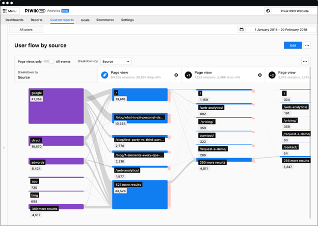
Don’t you just love saying the word “stack”? Besides being fun to say, having an analytics stack can be crucial for your business. Different platforms offer different advantages, and by combining them, you can gain a comprehensive understanding of your users’ journey. Marketing analytics tools (such as GA4 or Piwik PRO) can provide detailed information about where people come from and how they arrived at your website. When combined with behavior analytics, this data can paint a broader picture of the user journey. But wait, there’s more! Mix in Customer Data Platforms like Segment, and you can start to truly understand an entire user’s lifetime value to your business. Use these insights to make data-driven decisions and create a cohesive marketing optimization strategy.
Continuously Monitor and Adapt
“Nothing lasts forever” and “a picture is worth a thousand words”—these two phrases pretty much sum up this point. In the digital world, you can’t just set it and forget it. Digital trends are constantly evolving, and if you don’t keep up, you might end up like Blockbuster (DON’T BE BLOCKBUSTER). To stay ahead of the game, build visualizations that allow you to regularly review your behavior analytics data. This way, you can keep your finger on the pulse of changing user preferences and trends, and quickly see what matters most. By continuously adapting your strategies based on the insights you gain, you’ll be ensuring ongoing success. Think of it as a never-ending cycle of improvement—kind of like your daily skincare routine, but for your website (more lotion, don’t let it dry out!). Continuously adapt your strategies based on the insights gained to ensure ongoing success.
Implementing these 10 strategies and leveraging behavior analytics tools will help ecommerce websites’ performance and sales thrive. By diving deep into user behavior, identifying those annoying friction points, and continuously optimizing your site, you’ll be creating a powerful experience that turns users into customers. Remember, the ecommerce landscape is constantly evolving, so it’s crucial to stay agile and adapt your strategies based on the insights gained from behavior analytics. Continue to invest in enhancing the experience for your customers and you will see continued success! (unlike Blockbuster…poor Blockbuster).
About the author
Josh Silverbauer is a highly accomplished analytics and conversion rate optimization (CRO) expert, known for his ability to combine complex analytics concepts with music & humor…With over 10 years of experience, he has consulted with some of the world’s largest brands, and has spoken at major events like SXSW & MeasureSummit. Josh is currently the Head of Analytics and CRO at From The Future, a CX & performance growth agency, and previously served as CEO of Great Big Digital Agency for 6 years.
Mobile app analytics tools are essential for developers and marketers to understand user behavior, measure performance, and optimize the user experience. These tools provide insights into app usage patterns, user engagement, and marketing effectiveness, helping teams make data-driven decisions.
Choosing the right analytics tool depends on specific requirements such as platform, type of data needed, and integration capabilities. It’s crucial to focus on tools that answer key questions about your app’s features, user demographics, engagement drivers, and keep track of the most important KPIs.
As the mobile app landscape evolves, staying informed about the latest tools and trends in app analytics will be vital for your success in the competitive app market. This blog will present a summary of the best tools that are available in the market currently in 2024:
1. Microsoft Clarity
Here at Microsoft Clarity, we offer more than just your typical mobile analytics; we’re a leader in behavioral analytics with an array of innovative tools at your disposal. With features like heatmaps, session replays, and Copilot insights, we aim to provide a more nuanced understanding of user interactions and behaviors on your mobile app. Clarity’s crashes/errors feature is designed to efficiently identify and replicate issues, facilitating quicker fixes and conserving developer resources.
These capabilities – while maintaining full user privacy- will allow you to understand your user behavior across an array of attributes and filters. Backed by tech giant like Microsoft – Clarity incorporates Copilot that leverages LLM to present summarized insights to app owner on their user’s behavior and recommendations on how to improve their app. Clarity is designed to give developers, designers, and marketers alike a deeper insight into what users really do on their app, empowering them to make informed decisions and create more engaging, user-friendly mobile experiences. Oh, one more thing, we forgot to mention Clarity is a completely free tool!
Platform: Android, iOS (coming soon), React Native, Web-apps and Web
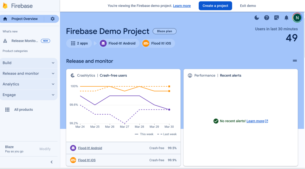
Next on our list is Firebase, Google’s robust mobile platform that has established itself as a staple in the mobile development community. Known for its comprehensive suite of tools that span across app development, quality assurance, and analytics, Firebase has become a popular solution for developers looking to streamline their workflows and enhance their apps’ performance and engagement.
The good news is that you no longer have to choose between Firebase & Clarity! Similar to the Google Analytics integration with Clarity – You can connect Firebase analytics/Crashlytics with Clarity mobile SDK as well. This enables developers to not only gather rich, actionable data about their app’s performance and user engagement, but also to gain insights into the “why” behind user actions through Clarity’s heatmaps and session recordings. This integrated approach offers a holistic view of mobile app analytics, empowering developers to optimize their apps in ways that were previously unattainable.
Platform: iOS, Android
Price: Free/Paid
Features
Hosting: Firebase provides a hosting service that allows developers to host their apps on a scalable infrastructure.
Crash reporting: Firebase includes a crash reporting feature that helps developers identify and fix issues that cause their app to crash.
Test Lab (for Android): Firebase’s Test Lab is a tool that allows developers to test their Android apps on a variety of devices and configurations.
Application performance monitoring: Firebase lets you monitor, identify and troubleshoot issues.
Google Analytics: The mobile app version of GA is included in Firebase.
3. Mixpanel
Mixpanel specializes in monitoring user interactions within mobile apps, offering the flexibility to craft tailored reports. Mixpanel is strong in its ability to dissect user activities, grouping them into segments and funneling these interactions to unveil how users engage with your application.
Beyond merely tracking actions, Mixpanel enriches its analysis with additional data points including users’ geographic locations, the devices used, and the channels through which they engage.
Platform: iOS / Android / Web
Price: Free / Paid (starts at $25/month for 1K users)
Features
A/B testing
Funnels
Engagement tracking
4. UXcam
UXCam delivers a broad perspective on app performance, by delving into user behavior with tools such as heatmaps and funnel analytics. Heatmaps provide a visual story of where users interact most, helping to pinpoint areas for improvement, while funnel analytics offer insights into conversion or drop-off points, guiding optimization efforts.
Glassbox distinguishes itself in the digital analytics space with its user-friendly platform, enabling teams to enhance customer experiences across websites and mobile apps in real-time. Its strength lies in AI-driven visualization and analytics tools that simplify the identification of user issues and optimization of the customer journey. This ease of use, however, comes at the cost of some advanced features found in more complex analytics tools, making Glassbox ideal for organizations that prioritize straightforward, actionable insights over deep, technical analysis.
Platform: IOS, Android, Web
Price: Paid
Features
Session replay
Crash analytics
Network and device performance
Interaction mapping
Engagement analytics
What are the benefits of using a mobile analytics tool?
Mobile analytics play a crucial role in the success of mobile apps, offering developers and businesses a wealth of insights that can drive strategic decisions and enhance user experiences. Understanding the importance of mobile analytics is key to leveraging their full potential. Here are some of the key benefits:
User Behavior Insights: Mobile analytics provide insights into how users interact with your app, identifying popular features, navigation patterns, and potential pain points. This knowledge is invaluable for creating user-centric designs and functionalities.
Improved User Engagement: By understanding what users like and dislike about your app, you can tailor content, features, and user journeys to increase engagement levels, encouraging more frequent and prolonged use of your app.
Enhanced User Retention: Analytics help pinpoint why users may be leaving your app or losing interest. With these insights, you can implement changes to improve retention rates, which is often more cost-effective than acquiring new users.
Data-Driven Decision Making: With concrete data on user behavior and app performance, decisions are no longer based on guesswork. This leads to more effective updates, feature developments, and marketing strategies.
Optimization of Marketing Efforts: Analytics can reveal which marketing channels and campaigns are most effective in bringing valuable users to your app, allowing for optimization of marketing spend and strategies.
Increased Revenue: By understanding user preferences and behavior, you can optimize in-app purchases, subscriptions, and ad placements, leading to increased revenue.
Better App Performance: Mobile analytics can help identify and troubleshoot app crashes, slow loading times, and other performance issues that can negatively impact user experience.
Competitive Advantage: Leveraging analytics allows you to stay ahead of the curve by continually innovating and improving your app based on user needs and trends, keeping you competitive in a crowded market.
There’s no universal solution in mobile analytics; the best choice depends on your specific needs and objectives. Taking the time to evaluate your options will ensure you find a tool that not only meets your current needs but also supports your app’s growth over time.
What Microsoft Clarity gets right – Why simple is actually the better bet.
Blog #1 in the series: How to become a Clarity power user
About the author
Josh Silverbauer is a highly accomplished analytics and conversion rate optimization (CRO) expert, known for his ability to combine complex analytics concepts with music & humor…With over 10 years of experience, he has consulted with some of the world’s largest brands, and has spoken at major events like SXSW & MeasureSummit. Josh is currently the Head of Analytics and CRO at From The Future, a CX & performance growth agency, and previously served as CEO of Great Big Digital Agency for 6 years.
Why Simple is Better
Doesn’t it feel like digital analytics is going in the opposite direction of the rest of technology? Everything is getting simpler, but digital analytics is getting more complicated, technical, and kinda blah. Sure, if you like torture you can sit for hours playing with SQL and looking at numbers in tables until your brain explodes, but shouldn’t there be an easier way? Making something complicated requires little thought, but creating something that is simple, yet powerful is incredibly difficult. So why invest time and resources into simple? Well, simple is better.
1. It’s easier to understand
I have a toddler, and my toddler loves to continually come back to mac and cheese every night. He knows that he will like mac and cheese. He likes the presentation of mac and cheese. Mac and cheese is digestible, delicious and dependable. You can even throw some peas in and he’ll be fine with it. The point? If you take a bunch of data and put it into a format that is digestible and easy to understand, it will get eaten (ahem…used)
2. It’s actionable
In my 10 year career, I’d like to say that most likely about 75% of the data that I’ve architected and implemented has gone unused (and that’s being generous). Why? Because people want to feel like they are being data-driven, so they ask for all sorts of data that they will never really use or understand. People have a vision for what they think they can do with data but then once put into practice, they find themselves confused by how to use it. Clarity provides the most streamlined, straightforward display of data that I’ve seen. The data is displayed directly on your website. You can see it at the heart of where the actions are happening. It gets to the point, and gets there quickly, and even if you need a little help, there’s AI right alongside to help you turn questions into action.
3. It’s so much less time-consuming
Getting stuck in analysis paralysis is one of the most wasteful activities one can do in business. Identifying trends quickly can lead to adaptation, agile thinking, and quick action which can create major opportunities.
4. Simple analytics lead to better optimizations
Simple analytics help you focus on the metrics that matter, enabling you to identify opportunities quickly. This simplicity accelerates your ability to gain insights, which in turn allows you to take action and improve your website’s user experience. An enhanced user experience can lead to increased purchases, leads, and conversions, directly contributing to the success of your business. The better your business does, the more money you will make. The more money you make, the more everyone will say “dang, look at that money-makin’ king/queen right there, that one’s got it goin on.” (and that’s the goal right?)
Clarity’s Core Features: Simple Design, Major Impact
Clarity is best known for its Heatmaps and Session Recording features. But within each one of those, there are hundreds of ways to slice and dice the data.
Say you wanted to see a heatmap of only people who converted, or compare two different landing pages to determine which one had a greater impact on a conversion action that happened on a completely different page. Yeah, you can do that. Or how about if you want to understand which elements specific channels interact with on their pathway to conversions, yeah, Clarity can do that too. Or what if you wanted to see which caused the most friction during a user’s pathway through the site…Clarity?…yep! And if you want to see these features in action, you’re in luck because, over the next few months, I’ll be releasing more blogs on how to get the most out of Clarity.
What makes Clarity standout?
How does all of this compare to other heat mapping & session recording tools on the market?
Clarity is free – nuff said.
Clarity has a beautiful design and UX that isn’t overly complicated and crowded by a billion unimportant features. It’s clean, user friendly and gets to the point.
Clarity has AI capabilities that ARE SUPER FRICKIN COOL YO.
Wow, you seem very passionate about those AI features Josh. Yeah, that’s because they are revolutionary.
It’s not often you get the heart of a startup within the midst of a major organization like Microsoft. Clarity is special like that. The group who breathes life into Clarity are pouring their soul into the product but the resources they get to pull from are BIG.
Here are some of the top features where Clarity really shines.
CoPilot
With a single click, Clarity has the ability to analyze hundreds of aggregate session recordings and output meaningful insights. You can filter by any criteria (i.e. people who converted, people who abandoned, returning purchasers, etc), then select their sessions and uncover any commonalities between them. It can even summarize entire heatmaps in a single click including any filters you want. Talk about time-saving insights.
Customization Options
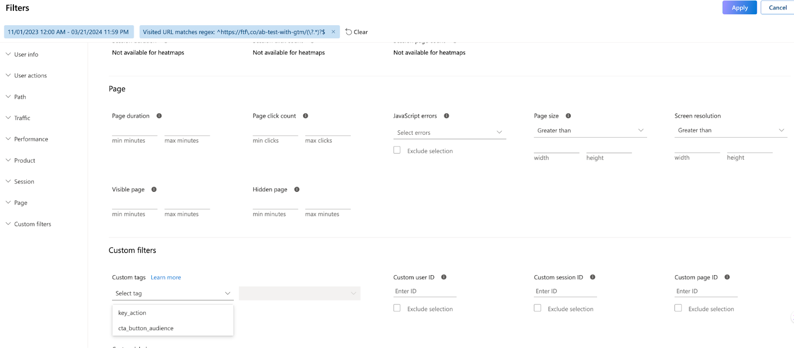
Beyond the AI, Clarity has the ability to be incredibly customizable. For instance, if you ARE the type of person who wants to configure every itty bitty thing yourself and not rely on the beauty of simplicity (which is totally fine…you do you), there are custom tags! Custom tags allow you to tag any type of event and ultimately build segments that you can filter down by based on your own criteria. So for instance if you’d like to understand how your logged in users are navigating the site or a page vs your non-logged in customers…you could tag the login event and have the ability to segment the users by whether they are an existing customer (though there’s a native smart event now for that too).
OR how about if you want to understand users’ pathways who answered a specific way on a quiz that was displayed, or a newsletter signup. All of this (and more) can be done with custom tags. Or even if you want to tag when someone looks at a picture of spinach on your site for 15 mins…that’s doable in Clarity…and maybe Copilot could help you figure out why they are doing that.
This feature also allows you to see A/B landing page tests in Clarity by configuring events based on the landing page variation that was shown.
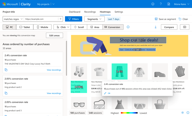
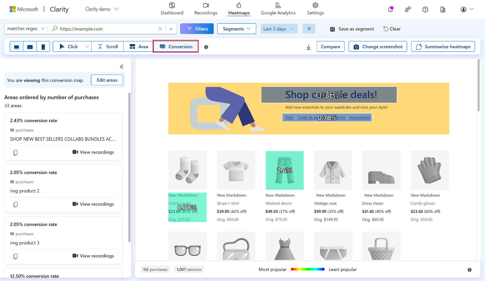
Conversion maps
One of the most powerful features that doesn’t get enough credit is Clarity’s conversion maps. This feature has the ability to rank elements based on how much it was clicked in relation to a purchase. There have been countless times that I’ve interacted with clients who want to know how their content/widgets end up leading to purchase. A lot of time is spent building these features and as with anything, time is money, so wouldn’t it be super useful to actually see how your time is equating to money and where to focus your efforts?
Clarity is one of the absolute best tools to quickly assess where to focus your energy on your website. It’s a super important experience analytics platform and it should be in every marketer’s analytics toolbelt. I happen to know that there are so many amazing things on the horizon for them as well. Do yourself a favor and add Microsoft Clarity. And then invite me to your website. Then I’ll say hi and you can watch it in a session recording.
Flutter vs. React Native: A Comparison of Cross-Platform Frameworks
If you are a mobile app developer, you might have faced the dilemma of choosing between Flutter and React Native for your cross-platform app development. Both frameworks are backed by tech giants (Google and Facebook, respectively) and have gained popularity and traction in recent years.
But which one is better for your project? What are the pros and cons of each framework? In this blog post we will help you compare Flutter vs. React Native in terms of:
Architecture
Performance
UI Components
Development Experience Community and Support
Device compatibility
we will try to answer these questions and help you make an informed decision about which tool to use for your upcoming app.
Architecture
Flutter is a cross-platform UI framework that allows you to create beautiful and fast applications for multiple platforms using a single codebase. Flutter was first released in May 2017 and has since grown steadily in popularity. Flutter uses a programming language called Dart, which is a modern, object-oriented, and optionally typed language that compiles to native code or JavaScript.
Flutter has its own rendering engine called Skia, which draws every pixel on the screen. This means that Flutter does not rely on the native platform widgets or components, but rather creates its UI elements called widgets. Widgets are the building blocks of Flutter apps, and they can be composed, customized, and animated to create rich and responsive user interfaces. Flutter also provides a hot reload and hot restart feature, which enables you to see the changes in your code instantly without losing the app state or restarting the app. This makes development faster and more enjoyable. Flutter also supports stateful hot reload, which preserves the app state even when you change the app logic.
Flutter 3 introduced some major changes and improvements to the framework. For example, you can now use Flutter to create applications for web, desktop (Windows, Mac, Linux), and embedded devices, in addition to iOS and Android. Flutter also improved its support for Firebase significantly.
React Native is another cross-platform framework that allows you to create native-like applications for iOS and Android using JavaScript and React. React Native was first released in March 2015 and has since become one of the most popular frameworks for mobile app development. React Native uses the same principles and concepts as React, a popular library for building user interfaces for web applications.
React Native uses a JavaScript bridge to communicate with the native platform modules and components. This means that React Native does not create its own UI elements, but rather uses the native platform widgets or components that are exposed to JavaScript. React Native also supports hot reloading and live reloading, which enable you to see the changes in your code without restarting the app or losing the app state.
Performance
Flutter has a performance advantage over React Native, because it does not need a bridge to communicate with the native platform. This reduces the overhead and latency of the communication, and allows Flutter to achieve smoother animations and transitions. Flutter also has a hot reload and hot restart feature, which enables faster development and testing cycles.
React Native has a performance disadvantage compared to Flutter, because it needs a bridge to communicate with the native platform. This increases the overhead and latency of the communication, and may cause some performance issues or bottlenecks. React Native also has a hot reload and hot refresh feature, but it is not as fast or reliable as Flutter’s.
UI Components
Flutter has a rich set of UI components, called widgets, that are highly customizable and expressive. Flutter widgets are based on the Material Design guidelines for Android, and the Cupertino design guidelines for iOS. Flutter also supports creating custom widgets, as well as using third-party widgets from pub.dev or other sources.
React Native has a basic set of UI components, called components, that are mostly based on the native platform components. React Native components are not as customizable or expressive as Flutter widgets, and may not always match the look and feel of the native platform. React Native also supports creating custom components, as well as using third-party components from npm or other sources.
Development Experience
Flutter has a better development experience than React Native, because it offers more tools and features to help developers create high-quality apps. Some of these tools and features include:
– Dart DevTools: A suite of debugging and performance tools that integrate with IDEs like VS Code and Android Studio.
– Flutter Inspector: A tool that allows developers to inspect and modify the widget tree and layout of their app.
– Flutter Outline: A tool that shows the structure and hierarchy of the widgets in the code editor.
– Flutter Test: A framework that supports unit testing, widget testing, and integration testing of Flutter apps.
– Flutter Driver: A tool that supports end-to-end testing of Flutter apps on real devices or simulators.
React Native has a worse development experience than Flutter, because it lacks some of the tools and features that Flutter offers. Some of these tools and features include:
– React DevTools: A suite of debugging and performance tools that integrate with browsers like Chrome and Firefox.
– React Native Debugger: A standalone app that combines React DevTools with other tools like Redux DevTools and Reactotron.
– React Native Testing Library: A framework that supports unit testing, component testing, and integration testing of React Native apps. – Detox: A tool that supports end-to-end testing of React Native apps on real devices or simulators.
Community and Support
Flutter has a smaller but growing community and support than React Native, because it is a newer framework that was released in 2017. However, Flutter has gained a lot of popularity and adoption in recent years, especially among startups and indie developers. Some of the notable apps that use Flutter include:
– Google Pay
– Alibaba
– eBay
– BMW
– Nubank
React Native has a larger but more fragmented community and support than Flutter, because it is an older framework that was released in 2015. However, React Native has also faced some challenges and controversies in recent years, such as the re-architecture project, the licensing issues, and the competition from other frameworks. Some of the notable apps that use React Native include:
– Facebook
– Instagram
– Airbnb
– Uber
– Skype
Device Compatibility
Flutter and React Native both support Android devices with ARM processors and Apple devices from iPhone 4s and onward. Both also support Android and iOS simulators for developing apps.
Apple devices require iOS 9 and above for Flutter apps, and iOS 11 and above for React Native apps. Android devices require API level 19 (Android 4.4) and above for Flutter apps, and API level 23 (Android 6.0) for React Native apps.
The minimum supported version for Expo-based React Native apps is Android 5 or iOS 10 and above.
Which framework should I use?
Well, at first you would need to examine your or your team’s existing skill set, the goals and requirements of your project.
If you already know JavaScript, writing mobile apps in React Native will be easier to develop and maintain. However, if you’re looking for better performance, stability, and a more cohesive environment between ecosystems, you should consider giving Flutter a try.
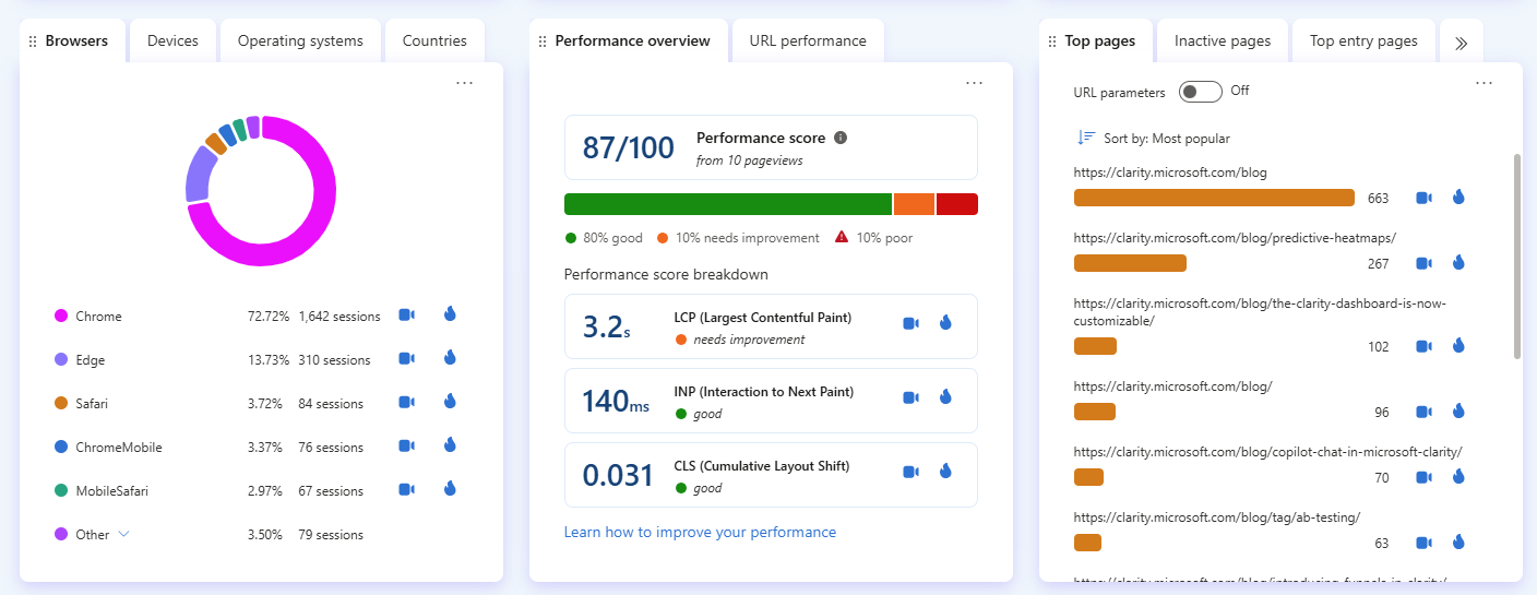
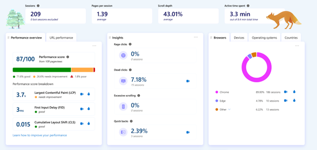
Hey there, website wizards! Ever wondered how to make your website not just good, but great? It’s all about what gives your visitors a smooth, speedy, and stable experience. And guess what? There’s a handy tool for that – the Performance widget! It’s like a health check-up for your website, focusing on what we call the core web vitals. Let’s dive in and make sense of all this, shall we?
What’s the Big Deal with Core Web Vitals?
Imagine visiting a website and waiting forever for it to load, or trying to click something and nothing happens, or even worse, everything jumps around as you’re reading. Annoying, right? That’s where core web vitals come into play. They’re the superheroes of website performance, ensuring everything loads fast, responds quickly, and stays put as it should. Here’s the trio that saves the day:
Largest Contentful Paint (LCP): This is all about speed. It measures how quickly the main stuff on your page loads. The goal? To have everything pop up in a jiffy, ideally in 2.5 seconds or less from when the page starts loading.
First Input Delay (FID): Ever talked to someone who takes ages to reply? Frustrating! FID is the web equivalent, measuring the time from when you first interact with a site to when it actually responds. We’re aiming for a quick comeback, 100 milliseconds or less.
Cumulative Layout Shift (CLS): Ever read a page and suddenly the text moves, and you lose your spot? That’s what CLS measures – the stability of your page’s layout. We want everything to stay put, with minimal shiftiness.
Navigating the Performance Widget
This widget gives you the lowdown on how well your site is doing in the performance department. It’s split into two main parts:
Performance Overview: Think of this as the highlight reel, showing you the overall score and letting you dive into specific issues with cool tools like recordings and heatmaps.
URL Performance: This is where you get down to the nitty-gritty, analyzing each page to see where you can make improvements. Sort by score, LCP, FID, or CLS, and use those recordings and heatmaps to get a clearer picture.
And hey, you can even set your favorite tab as the default. Just a little customization to make your life easier.
Fixing the Glitches
So, you’ve got the scores, but what if they’re not what you hoped for? No worries, we’ve got fixes!
LCP Issues? Might be those hefty images or some sluggish server response. Try optimizing images or giving your server a boost.
FID Frustrations? There is probably some heavy JavaScript at play. Look into loading it differently or cutting down on the bulk.
CLS Concerns? This usually happens when things load unexpectedly. Make sure images and videos have dimensions set, and keep ads and embeds in their place.
Putting It All Together
Now that you’ve got the lowdown, use those insights! Watch how users interact with your site, especially where there are hiccups. See a high LCP? Check out how visitors react. Frustrated clicks could mean FID issues, and unexpected layout shifts point to CLS problems. Use what you learn to make your site better and keep checking back with the widget to see your progress.
Flurry, owned by Yahoo, one of the oldest mobile analytics SDKs, announced that they are sunsetting in March 2024. The company never recommended alternatives, so in this blog, we have listed a few options to help you make up your mind while you are deciding on your switch.
1. Microsoft Clarity
Microsoft Clarity is a free behavioral analytics tool that helps you understand your customer’s behavior as they are using your mobile app. While tools like Flurry give you a quantitative picture, clarity can give you deeper qualitative insights into the reasons why users are behaving in the way they do.
Additionally, through Clarity’s getCurrentsessionURL API, you can link clarity’s session recordings with other behavioral analytics tools (e.g Firebase Analytics SDK) to get more insights
Refer to this blog for the exact steps on how to integrate Clarity with Firebase.
Pros:
100% Free with no traffic limits.
Lightweight SDK – adds up to 500MB only to your app size.
Respects users’ privacy
Super-friendly UI.
Can be linked with other traffic analytics tools (Firebase, Mixpanel etc..)
Cons:
Some platforms might still not be supported yet.
2. Firebase Analytics
The Firebase platform is already extremely popular amongst app developers as it provides them with a robust and feature-rich mobile app development platform. Firebase Analytics SDK provides developers with a range of tools to track user behavior and app performance like user segmentation, crash logs, app performance metrics, etc.. and is a close match for Flurry Analytics.
Pros:
Free.
Rich features including real-time debugging, tracking custom events, user segmentation and useful insights. Seamless integration with AdMob helps in the Ad monetization and better analysis of your users’ value and your application’s performance It also helps in better application advertising strategies.
Helps generates traffic to your app through app indexing on google search engine which can increase your app ranking.
Cons:
SDK size might be a bit large for small apps.
Data for analytics is often sampled.
3. Amplitude
Amplitude is one of the popular event-based quantitative analytics for websites and also have SDKs for different mobile apps platforms. Amplitude offers a comprehensive list of essential event-based analytics methods, and also some predictive analytics features to predict user behavior.
Pros:
Data extraction/export capabilities.
Rich dashboards, providing insights into customer behavior and product usage.
Cons:
Steep learning curve.
Complex setup/integration process.
Paid.
4. Mixpanel
Mixpanel is one of the leading traffic analytics for mobile-apps. It helps product teams analyze metrics and app performance indicators based on set demographics and properties.
Pros
Track a generous number of events with good visualization
Integrates with existing tech-stack through a rich set of APIs.
Friendly User Interface
Cons
Prices-based features. You would often find yourself paying for extra (more useful) features set so it’s not affordable for everyone.
Best Flurry alternative for mobile app analytics
We know that Mobile app analytics are important for product teams to fully understand how customers behave with their product. if you’re looking for an alternative to Flurry Analytics,ClarityMobile SDK + Firebase Analytics are excellent options that can provide you with the same level of value and even more.
By combining the powerful analytics capabilities of Firebase with the session replay and heatmap features of Clarity Mobile SDK, you can gain a comprehensive understanding of how users are interacting with your app and make data-driven decisions to improve user experience and engagement. All at Zero cost.
Additionally, it’s worth noting that both Firebase and Clarity Mobile SDK, both backed up by tech giants like Google and Microsoft, are constantly updating and improving their features to better serve their users. This means that you can expect to see new and innovative features added to these platforms in the future, further enhancing their value and usefulness.
How Microsoft Clarity’s Content Insights Can Be Your Blog’s Best Friend
Ever wondered if there’s a way to really understand what’s going on with your website? Why are some posts hit and others a miss? Well, that’s where Microsoft Clarity’s Content Insights comes into play, and trust us, it’s a game-changer.
The Inside Scoop
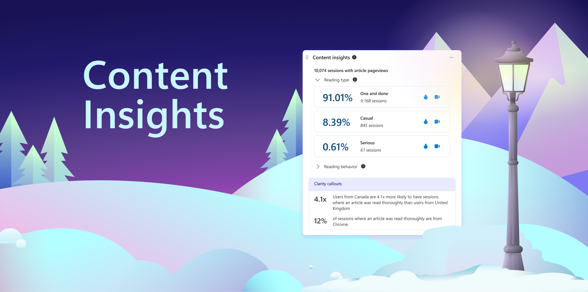
So, here’s the deal: Content Insights is like having a super-smart friend who watches how people interact with your site. It notices the little things – which articles people love, how many they read, and even where they seem to get stuck or lose interest.
Content Insights
The cool part? You can get the lowdown on specific stuff you care about such as:
Reader types: Categorizes sessions based on the number of articles viewed.
One and done – read 1 article
Casual – read 2-3 articles
Serious – read 4 or more articles
Reading behavior: Categorizes readers by how they consume the articles.
Engaged – User finished reading one or more articles
Abandoned at headline – This one sounds as it is. The user only reads the headline and nothing else.
Clarity callouts: We thought it’d be nice to give you some high-level insights to your data with Clarity callouts (pictured above). The callout is determined by what Clarity believes are the most interesting and helpful data points for you. Pretty cool.
Setting Up Content Insights
Most WordPress blogs already have Content Insights readily available, providing valuable insights into your audience’s engagement with your content. If not, to enable this feature, please refer to the “Content Insights documentation” for detailed guidance and tips.
The Bottom Line
Microsoft Clarity’s Content Insights is not just another tool; it’s your website’s best ally in understanding and enhancing user engagement. Dissecting reader behaviors and preferences empowers you to tailor your content strategy to meet your audience’s needs more effectively. Whether you’re aiming to convert one-and-done visitors into regular readers or to deepen the engagement with your serious audience, Content Insights provides the clarity you need to make informed decisions.
Webflow Meets Microsoft Clarity: Elevating Web Design with Powerful Insights
In the digital world, success is closely tied to understanding user behavior, a task made easier with tools like Microsoft Clarity. This analytics tool sheds light on how users interact with your website or application, providing crucial insights for optimization. However, before diving into analytics, you need a digital platform, and this is where many hit a roadblock: coding. The complexity of web development can be daunting, but there’s a solution that sidesteps this hurdle—Webflow.
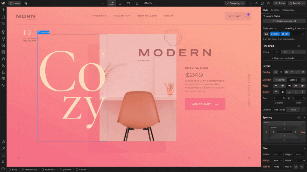
What is Webflow?
Webflow is a visual development platform that empowers designers to build with the full power of code — without writing any. Instead of typing out code, you develop it visually in a way that is intuitive to how you work. As you build in Webflow, it automatically generates the same production-grade HTML, CSS, and JavaScript that powers the web’s most sophisticated sites. It’s the best of both worlds: get the autonomy and speed of simple website builders combined with the power and flexibility of code. With Webflow, there’s no limit to what you can build. The only limit is your imagination.
Better together
When Webflow and Microsoft Clarity join forces, the synergy between the two elevates the web design experience to new heights. By integrating Clarity’s behavioral analytics into your Webflow projects, you unlock the power to make informed iterations that truly resonate with your audience. Heatmaps offer a visual representation of user engagement, highlighting areas that attract the most attention or might be causing confusion. Session recordings go a step further, providing a real-time playback of user interactions, and allowing you to witness firsthand the user journey through your site. This combination of insights empowers you to tailor your Webflow creations not just to what you think your users want, but to what their actions unequivocally show they are looking for, ensuring every update or tweak is a step towards a more intuitive and user-friendly design.
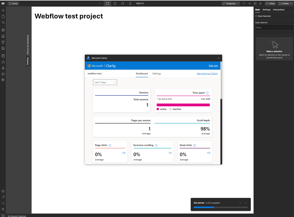
Embedded View
The integration of Microsoft Clarity with Webflow lets users access Clarity’s dashboard directly within the Webflow Designer, while they are building. This seamless experience means Webflow users can analyze their site’s user behavior data without leaving the Webflow platform, keeping all essential insights in one place. Here is a list of some of the data you can access from Clarity in Webflow:
rage clicks
dead clicks
javascript errors
scroll depth
countries
devices
popular pages
referral Urls
Beyond the initial insights provided, the embedded view further expands your analytical capabilities with additional data points. It also features dedicated icons for quick access to heatmaps and session recordings in Clarity, allowing for a deeper dive into user interactions.
How to get started
Integrating Microsoft Clarity with your Webflow projects is a straightforward process that enhances your site with powerful analytics. Here’s a concise guide to get you started:
Clarity in Webflow: Use this direct link to the app listing in Webflow.
Add Clarity: You can add Clarity to your entire workspace or a specific site within Webflow.
Publish Changes: To activate Clarity and start collecting data, publish the changes to your site.
View in Designer: In Webflow’s designer view, Clarity will appear as an installed App.
Check Clarity Dashboard: Once data starts coming in, you can view it on the Clarity dashboard directly.
Please refer to our documentation for detailed guidance on integrating Clarity with Webflow.
The Microsoft Clarity App in Webflow is a game-changer for anyone looking to create engaging and effective websites, not just for seasoned professionals. This powerful combination democratizes web design, allowing individuals of all skill levels to harness the power of behavioral analytics and intuitive design tools. With Clarity’s insights into user behavior and Webflow’s user-friendly design platform, anyone can craft websites that resonate with their audience and drive better outcomes.