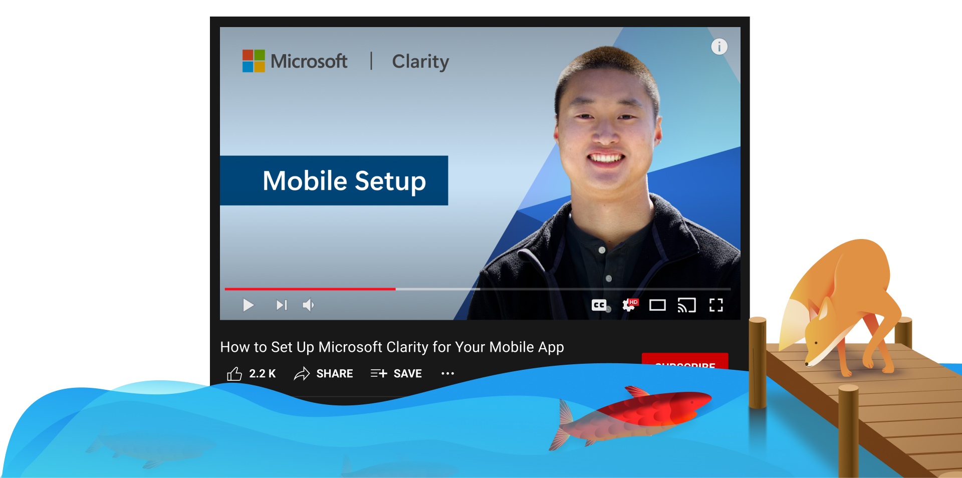
In this video, learn how to setup Microsoft Clarity for your mobile app and start seeing data within minutes!
Sign Up: Go to clarity.microsoft.com and click “Sign Up.” After logging in, navigate to the projects page.
Create a Mobile Project: Click “New project,” select “Mobile app,” and choose your platform. We’re continuously adding support for more platforms, so let us know if yours isn’t listed!
Integrate the SDK: For Android, add the Clarity Package to your gradle file, update your project repositories, and include the latest dependency version in your build.gradle script. Then, copy the initialization code from the dashboard into your app’s startup activity.
Check Your Data: Release your app and start seeing user traffic on your Clarity dashboard within a few hours.
Get started by watching the video below!
Don’t forget to subscribe to our YouTube channel and follow us on social so you know when our next video will drop!
Enjoy!
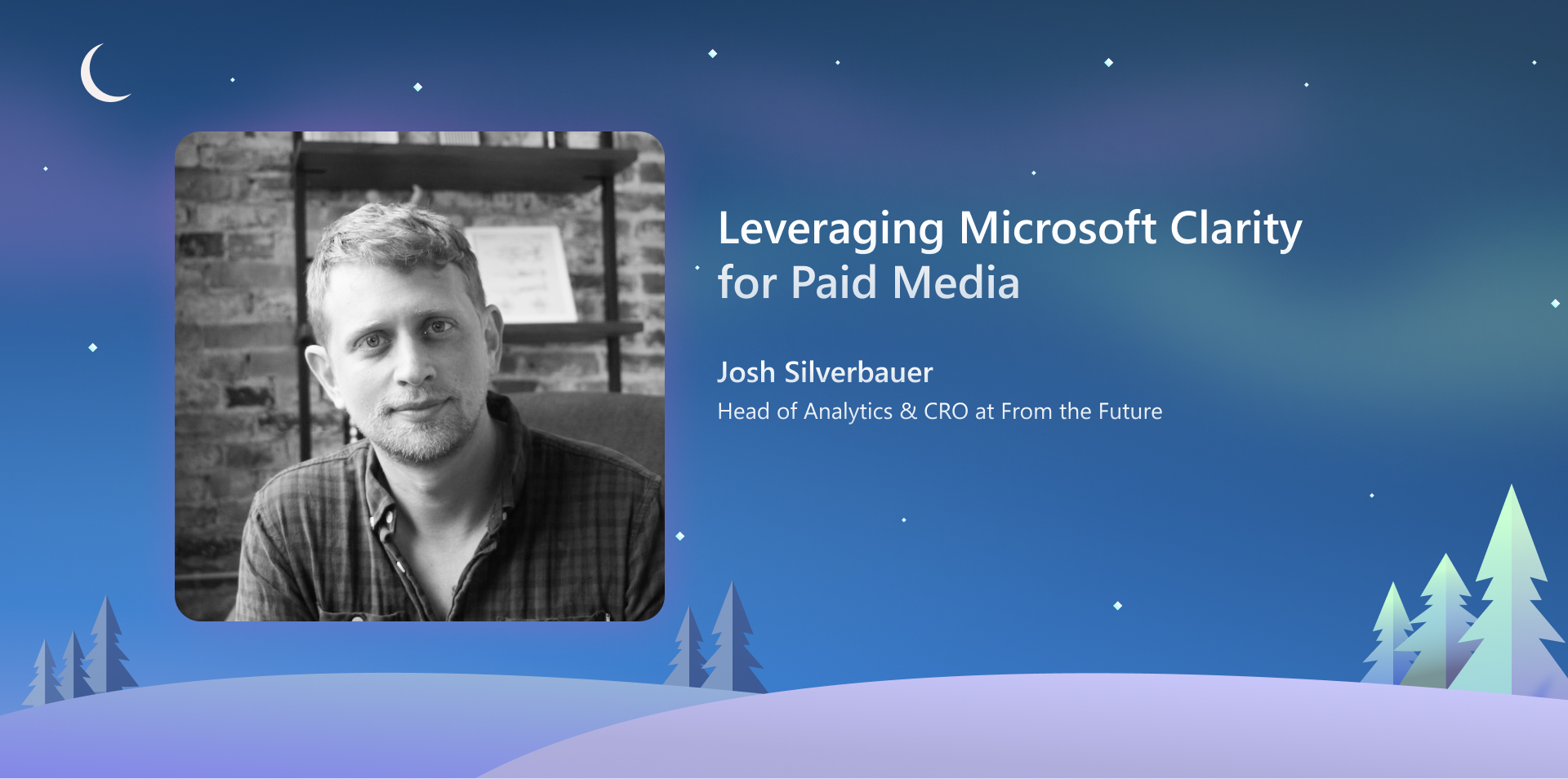
Leveraging Microsoft Clarity for Paid Media Analysis
Microsoft Clarity is a powerful engagement and behavior analysis tool with broad applications. In this blog post, we’ll focus on how to maximize its value from a paid media perspective. We’ll explore Clarity’s features that are particularly useful for analyzing campaign performance, user interactions with landing pages, and identifying potential drop-off points in your website funnel.
Key Features for Paid Media Analysis
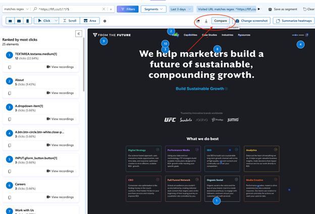
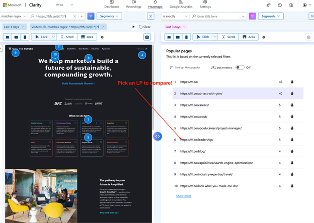
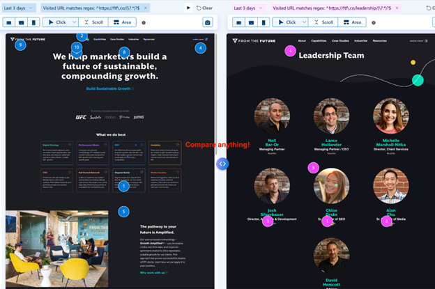
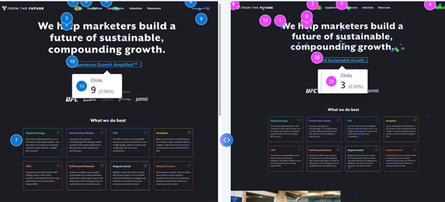
1. Landing Page Comparison
Clarity is great at analyzing individual landing pages, but it also offers a super valuable comparison feature. This is particularly useful when A/B testing landing pages for paid campaigns. You can use the comparison feature to analyze the performance of two different pages side by side, which is ideal when you’re using different URLs for your tests.
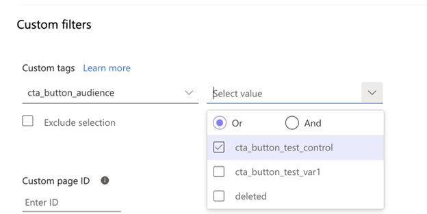
For those using A/B testing tools, Clarity integrates with platforms like A/B Tasty, Optimizely, and Kameleoon. If you’re using a different A/B testing setup – you can build custom tags to filter and compare different variations of the same page. This flexibility allows you to compare and determine which version of a page has more of an influence key actions.
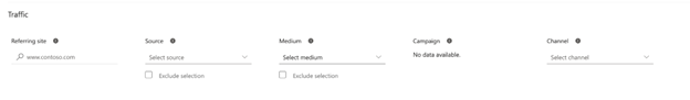
2. Leveraging UTMs
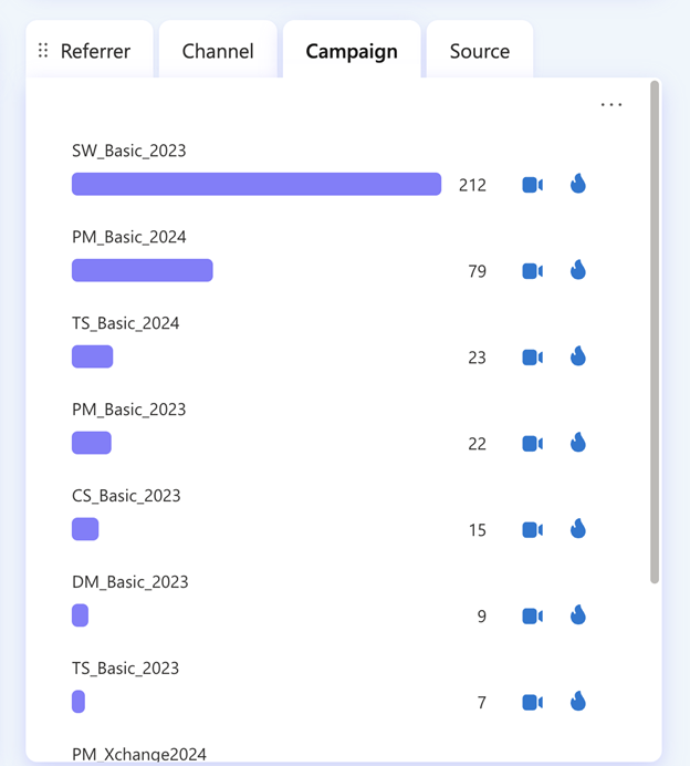
UTM parameters are crucial for tracking user origins and campaign performance. In Clarity, UTMs are utilized in several ways. The platform offers built-in reports for campaigns, referrers, channels, and sources, which you can easily access from the dashboard. These reports allow you to quickly click into heat maps and session recordings that came from specific campaigns.
You can also drill down into specific campaigns to view smart events, funnels, and specific heat maps and recordings. The comparison feature I mentioned earlier isn’t limited to landing pages – you can use it to view how different campaigns are performing side by side. This comprehensive view of your UTM data helps you understand the full impact of your campaigns across various metrics and user behaviors.
For more information on how to use UTMs in clarity, view my video below.
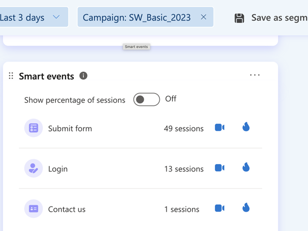
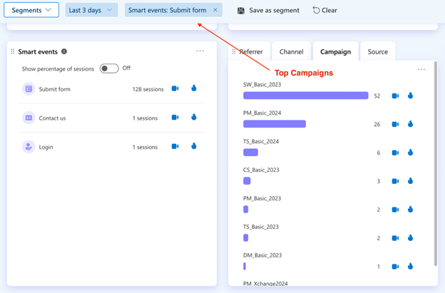
3. Smart Events
Smart events in Clarity represent valuable actions that indicate site performance, such as purchases or form submissions. When you drill down into smart events, it can allow you to see how different campaigns and channels are performing for specific actions. This is incredibly useful for understanding which of your marketing efforts are driving the most valuable interactions on your site.
Smart events will also enable you to create funnels from your landing page to your desired end result. By using UTMs in conjunction with these funnels, you can drill down on how each campaign is driving traffic through your conversion pathways. This level of detail helps you identify where users might be dropping off and which campaigns are most effective at guiding users to completion.
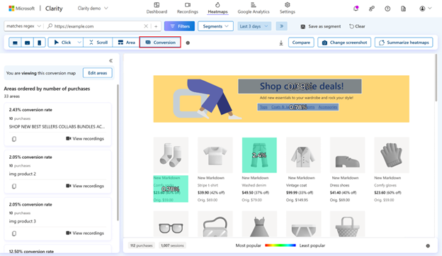
4. Conversion Maps
For e-commerce stores, Clarity’s conversion maps are valuable for understanding content performance. These reports allow you to determine what content affects your purchase rate. By analyzing conversion maps, you can identify which pieces of content are most valuable on the pathway to conversion. This insight is crucial for informing your creative decisions, helping you to emphasize the most effective content in your marketing materials and on your site.
5. Chat
Clarity’s chat feature offers a quick and intuitive way to gain insights into campaign performance. You can ask it any question about your data and receive a prompt response. When combined with other features like smart events, landing page analysis, and UTM tracking, chat becomes a powerful tool for understanding the impact of your campaigns quickly and effortlessly.
Future Developments
Microsoft Clarity is continually evolving, with exciting developments on the horizon. Upcoming integrations with paid media platforms promise to enhance its capabilities even further. These integrations will allow for syncing of smart events and automate campaign optimization, further streamlining your paid media analysis and decision-making processes.
Conclusion
Microsoft Clarity offers a robust set of features for understanding campaign performance and analyzing the full funnel of your paid media efforts. By leveraging these tools and reports, you can gain deep insights into your campaigns and scale your reporting effectively. As Clarity continues to develop, it’s positioning itself as an excellent choice for paid media analytics, providing a wealth of valuable information to optimize your campaigns. Whether you’re comparing landing pages, analyzing UTM data, or diving deep into user behavior with smart events and conversion maps, Clarity offers the tools you need to make informed decisions and improve your paid media performance.
Setup Microsoft Clarity on your website in three easy steps and start seeing data within minutes in this video!
1️⃣ Sign Up: Visit clarity.microsoft.com, log in with your Microsoft, Facebook, or Google account, and add your project.
2️⃣ Add a Project: Enter your project details and industry info. If you’re in a sensitive field, confirm compliance with data laws.
3️⃣ Install Tracking Code: Use integrations for platforms like Shopify and WordPress, or manually add the code to your website’s header.
Get started by watching the video below!
Don’t forget to subscribe to our YouTube page and follow us on social so you know when our next video will drop! Stay tuned for how to set up Clarity for your mobile app!
Enjoy!
Watch Now: An Overview of Copilot in Microsoft Clarity
Heatmaps are a powerful tool for understanding how users interact with your website. By visually representing user behavior, heatmaps reveal critical insights about where visitors are engaging, where they drop off, and how they navigate through your site. Whether you want to optimize the placement of key elements, improve user experience, or boost conversion rates, effectively using heatmap data can be a game-changer.
We’ll explore different types of heatmaps and show you how to leverage the insights they provide to make informed decisions that drive better results for your website.
What are heatmaps?
Heat maps provide insights into how visitors engage with your website by showing where they scroll, stop, and interact. Analyzing these patterns allows you to identify high or low user engagement areas. You’ll see that the highest engagement areas are marked in red while the lowest engagement areas are marked in blue.
Microsoft Clarity categorizes heatmaps into four different types:
Scroll
Click
Area
Conversion
It’s important to note that Conversion heatmaps are only available on Shopify websites.
With these heatmaps, you can use filters, compare heatmaps for the same page on different dates, and use Copilot to receive AI-generated summaries of them. You’ll receive insights into user behavior patterns and suggestions based on these.
Heatmap insights can guide you in strategically placing elements on a page to enhance visibility, boost user engagement, and improve conversion rates. Let’s get into each type and how we can put this data to use.
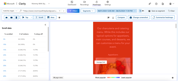
Scroll heatmaps
Scroll heatmaps show you how far down a user scrolls on a page. You’ll see the average fold, or what loads on a page before they scroll. You’ll also be able to look at the percent scrolled, the number of visitors that visited that part of the page, and the percent drop off per section.
Using Scroll heatmaps to improve user engagement
Plenty of websites overlook the importance of the space above the fold. This is the area where you should be placing your most important content. The scroll heatmap on Clarity will show you exactly where that is and the drop-off of users once they load the page.
Often, websites use a hero image that’s way too big and has nothing but an H1 and an image when a user first loads the page. This isn’t helpful and can deter people away from that page and even the site as a whole.
It’s best to place the page’s most important content loads above the fold, whether that’s a paragraph, form, call-to-action button, etc. Use that space to give users what they are looking for and if possible, direct them to the next place they want to go.
You can also use the percent scrolled data to find out what content users are not reaching on a page. If most users aren’t reaching something you believe they will find useful, then experiment with changing the layout of the content.
Click heatmaps
Click heatmaps show you elements on a page with high engagement. Elements that users are constantly clicking on will show up in red, while lesser clicked elements will be blue. When you look at this section, you can toggle between the following click data:
All clicks
Dead clicks
Rage clicks
Error clicks
First clicks
Last clicks
This information is crucial to seeing which parts of a page draw user attention the most. You can use this to lead them to other pages on the site, to fill out a form, give you a call, etc.
Using Click heatmaps to improve user engagement
Use your click heatmap data to find the following:
Broken links
Elements that look clickable, but aren’t
Most clicked elements on the page
Least clicked elements on the page
We recommend using the dead clicks and rage clicks data to find out which parts of a page or text users think should lead to some desired action but don’t. For example, in my case study of a home building client, I found out that users who visited the floorplans page clicked on the individual floorplans titles and expected to be directed to a page specific to that floorplan.
The basic information for each floorplan was on that page, but users wanted more information. Seeing this data led my team to create individual floorplans and we received way fewer dead clicks on the general floorplans page after that. This helped us continue to lead our users down the funnel and give them the information they needed to decide whether they wanted to contact our client.
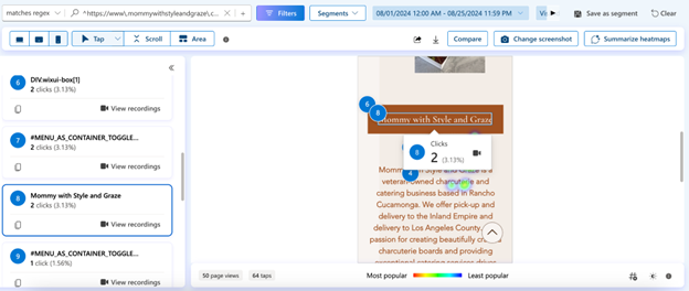
Below, is a click heatmap example from a charcuterie and catering business.
You can see that there were 2 clicks on the company’s name during the month of August. This is a small business site with not a lot of visitors, so the 5th-8th most clicked elements on the page all have 2 clicks.
Since users are scrolling down to this part of the page and a couple of them ended up clicking on the name, we might want to test placing a different element here. It might be best to try placing a call-to-action button that leads to the catering business’s menu instead and seeing how well that does.
Use your click data to run A/B tests and find out what hypotheses improve user behavior metrics.
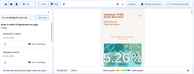
Area heatmaps
Area heatmaps show you the total clicks in any given area on a page or groups of pages. This is similar to click heatmap data, but instead, you will receive a click-through rate (CTR) per area and can see the data for all elements within that area.
Using Area heatmaps to improve user experience
This type of heatmap is incredibly useful in narrowing down your focus to specific sections on a page. Let’s say there is a CTA section on a service page that includes a call button, a contact form button, and a link to the business’s address. You can view the CTR for the entire section and then narrow it down to those specific elements to see which CTA is the most popular.
You then may want to test changing the order of the CTAs and see if that has an impact on which one is the most effective. Or if you want to receive more phone calls vs form submissions, you might want to remove the contact form button from the area and place it elsewhere.
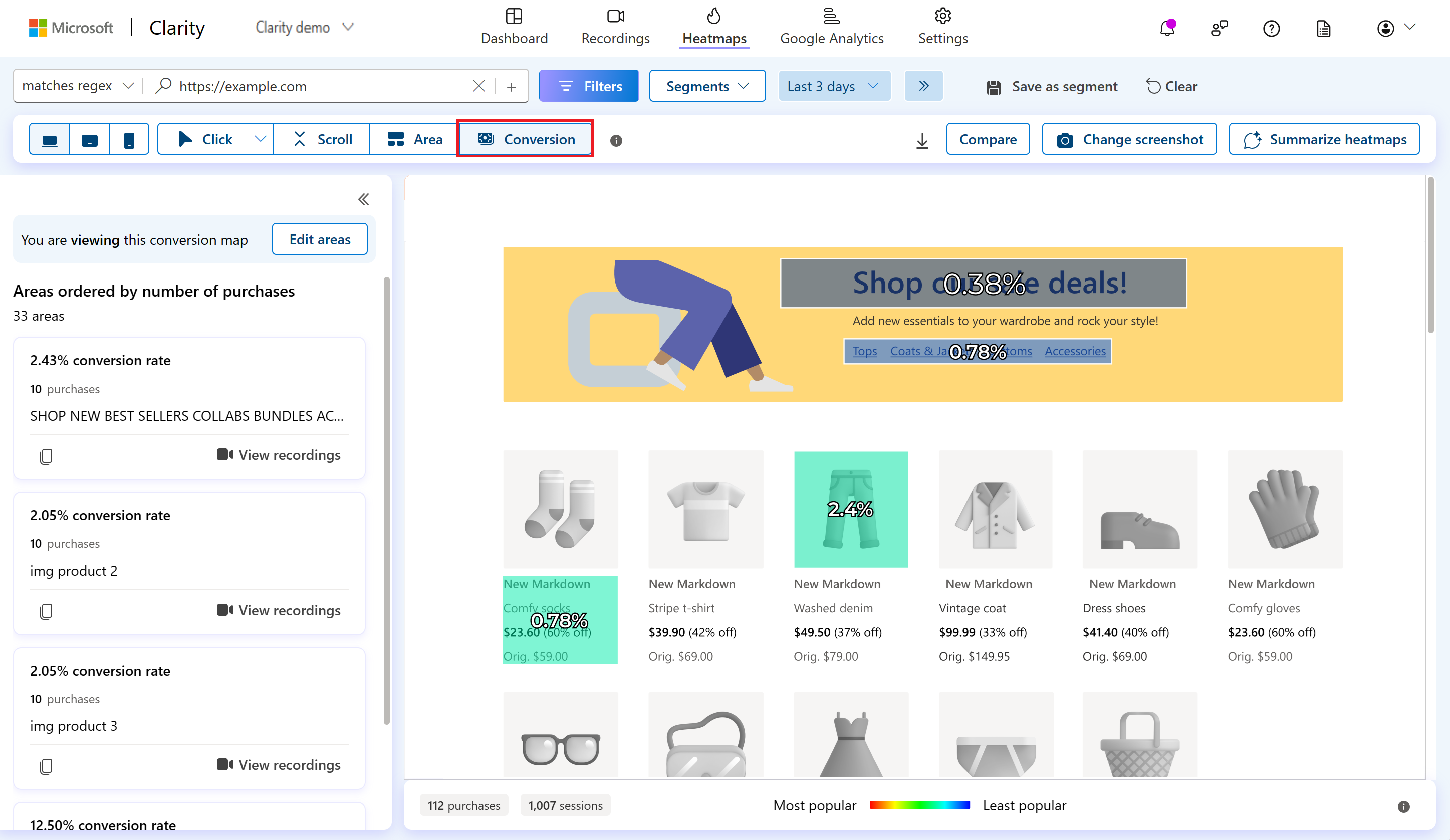
Conversion heatmaps
This heatmap exclusive to Shopify sites, shows the percentage of sessions that led to a purchase when a user clicks within a selected area. It’s important to know which pieces of content and widgets lead users to make a purchase, and with these heatmaps, you can now know where to focus your efforts.
Using Conversion heatmaps to improve conversion rates
Check out this data on your collection pages and see which products are driving the most conversions and which ones are driving the least. You can try testing new images for the lesser-clicked products or test the placement of certain products on a page to see if that impacts conversion rates.
Turning Insights into Action
Heatmap data empowers you to make data-driven decisions that align with your goals.
By analyzing scroll, click, area, and conversion heatmaps, you can optimize your site to enhance user engagement, improve navigation, and ultimately increase conversion rates. Start using these insights today to lead to a more effective and user-friendly website.
Celeste Gonzalez started her SEO career while blogging about her journey as a first-generation college student at U.C. Davis. After completing her Bachelor of Science in Managerial Economics, she joined RicketyRoo as an SEO Specialist. After a brief but impactful eight-month tenure as an SEO Specialist, Celeste quickly ascended to the role of SEO Strategist, where she shaped innovative strategies for nearly two years. Celeste now spearheads RooLabs, the cutting-edge SEO testing division at RicketyRoo, where she actively engages with the SEO community by sharing her experiences—highlighting achievements and challenges.
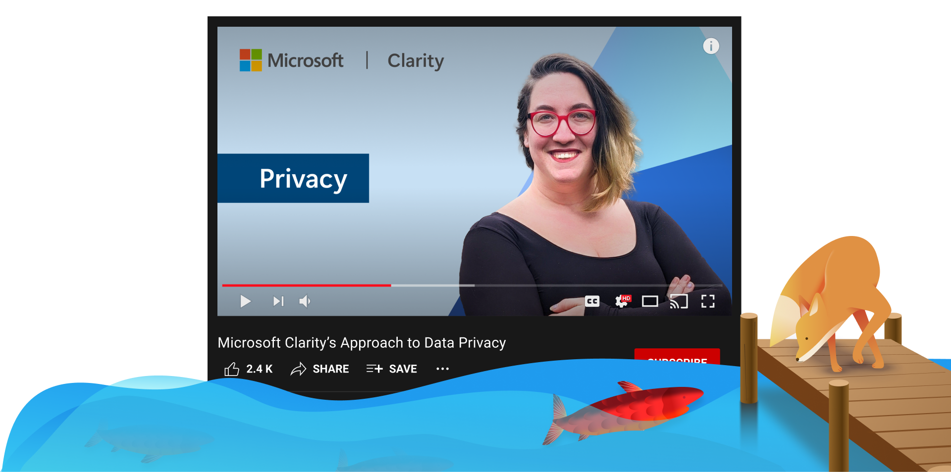
Watch Now: Microsoft Clarity’s Approach to Data Privacy
Hello Clarity fans! We are excited to announce the launch of our official YouTube channel and a series of Clarity tutorial videos so you can learn more about our product, its features and how you can use them from one of the members of our team!
We will be releasing our tutorial videos throughout the rest of this year for you to watch and learn more about your favorite behavioral analytics tool!
We will cover the following topics in our tutorial videos:
What is Microsoft Clarity?
Microsoft Clarity’s Approach to Data Privacy
An Overview of Copilot in Microsoft Clarity
How to Setup Microsoft Clarity for Your Website
How to Setup Microsoft Clarity for Your Mobile App
Navigating the Microsoft Clarity Dashboard
Utilizing Visitor Profiles in Clarity
Using Filters in Microsoft Clarity
How to Utilize Custom Filters in Microsoft Clarity
An Overview of the Microsoft Clarity Watchlist
An Overview of Smart Events in Microsoft Clarity
Utilizing Funnels in Microsoft Clarity
An Overview of E-Commerce Features in Microsoft Clarity
How to Use Heatmaps in Microsoft Clarity
An Overview of Microsoft Clarity Insights
An Overview of Session Recordings in Microsoft Clarity
How to use the Microsoft Clarity Data Export API
An Overview of the Settings Page in Microsoft Clarity
How to Navigate the Google Analytics Dashboard in Microsoft Clarity
An Overview of the Microsoft Clarity Live Extension
Check out our first video below and let us know what you think in the comments section!
Make sure to subscribe to our YouTube page and follow us on social so you know when our next video will drop!
Enjoy!
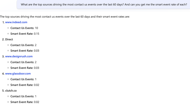
User intent metric: Understand engagement at a glance
Ever wondered if the new traffic coming onto your website is “good traffic”? Or if you’re getting “better” users from one campaign versus another?
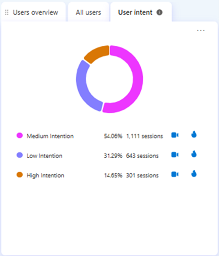
Clarity’s newest ‘User intent’ feature answers these questions and more. We group your website traffic into three categories based on a combination of user behavior signals, enabling you to quickly identify your most promising -and unpromising- website visitors.
How does it work?
Using a combination of signals, like session length, user clicks and achieving key smart events, Clarity categorizes your website traffic into one of three buckets:
Low Intent Sessions: These are brief interactions where visitors show minimal engagement, either spending less than 5 seconds on the site or staying longer without interacting (no clicks or scrolls). This could indicate issues like bot traffic or a mismatch between the content and the audience.
Medium Intent Sessions: These sessions involve moderate engagement, with users spending more than 5 seconds on the site and interacting to some extent—either through clicks, scrolls, or minimal key smart events. These visitors show some interest but do not necessarily convert.
High Intent Sessions: These sessions reflect strong engagement, with users spending over 5 seconds on the site and actively interacting through clicks and key smart events, indicating a high level of interest that often leads to conversion or near conversion.
Where can I find it?
You can find the User Intent module behind the User Overviews section in the Clarity dashboard and apply filters across all three buckets.
We recommend filtering to interested campaigns or referrers, and then looking at the User Intent module to understand the breakdown.
For more details, please visit our documentation here.
Conclusion
Our new User Intents feature is a great way to understand at a glance what quality of traffic is on your website. High percentage of high intent users indicate your site is performing well and attracting the right user base. High percentage of low intent users indicate there is room for optimization either on your site or with your targeting.
Let us know how you like using this on X @msftclarity!
Boost Your SEO: A/B Testing with IndexNow and Microsoft Clarity
In the ever-evolving world of digital marketing, staying ahead of the competition requires constant innovation and adaptation. One of the most effective strategies to enhance your website’s performance and search engine optimization (SEO) is A/B testing. By comparing two versions of a webpage to see which one performs better, you can make data-driven decisions that significantly improve your site’s user experience and search engine rankings.
Why A/B Testing is Important for SEO
Data-Driven Decisions: A/B testing allows you to base your decisions on actual data rather than assumptions. By testing different content elements on your webpage, such as headlines, key words, images, or call-to-action buttons, you can identify what resonates best with your audience.
Improved User Experience: A better user experience often leads to higher engagement, lower bounce rates, and increased conversions. A/B testing helps you fine-tune your website to meet the needs and preferences of your visitors, which in turn can boost your SEO rankings.
Increased Conversion Rates: By identifying the most effective elements of your webpage, A/B testing can help you optimize your site for higher conversion rates. This means more leads, sales, or whatever your conversion goals may be.
Reduced Bounce Rates: A well-optimized page that meets user expectations will likely have a lower bounce rate. Search engines consider bounce rates as a ranking factor, so reducing them can positively impact your SEO.
Adaptability: The digital landscape is constantly changing. A/B testing allows you to stay agile and adapt to new trends and user behaviors, ensuring your website remains relevant and competitive.
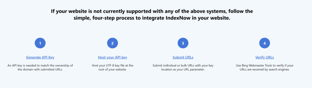
How IndexNow Can Help
IndexNow is a powerful tool that can significantly enhance your A/B testing efforts. Here’s how:
Instant Indexing: One of the biggest challenges in SEO is getting your changes indexed quickly by search engines. IndexNow provides a powerful solution by allowing you to instantly notify search engines of any updates or changes to your website. This means your A/B test variants can be reflected in search engine rankings much faster. Combined with Clarity’s insights into user behavior and engagement, you can make more informed decisions to optimize your site’s visibility and performance.
Easy Adoption: IndexNow integrates seamlessly with various SEO tools such as Yoast, SEOPress, and Ahrefs. It also supports a range of content management systems (CMS) and plugins, including WordPress, Wix, and Duda. For a full list of supported tools and plugins, visit bing.com/indexnow/getstarted
Comprehensive Insights: Through both top-level metrics and detailed reports, website owners have a comprehensive view of IndexNow submitted URLs’ indexing performance that allows them to make more informed, strategic decisions to enhance their online visibility. With the user-friendly interface on Bing Webmaster Tools, they can easily see which URLs have visibility in search engines, accurately track when their tests are active, and measure the effectiveness of different approaches.
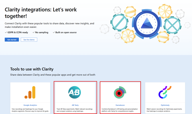
Clarity and A/B Testing
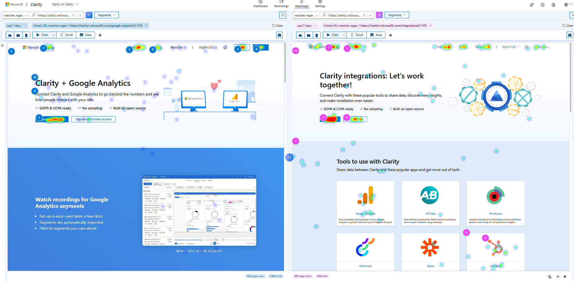
Microsoft Clarity provides valuable insights through session recordings and heatmaps and integrates seamlessly with A/B testing platforms like AB Tasty and Kameleoon enhancing your ability to analyze and optimize your website.
AB Tasty Integration:
Session Recordings and Heatmaps: By integrating Clarity with AB Tasty, you can track experiments and view session recordings and heatmaps for each variation. This helps you understand how users interact with different versions of your webpage and identify the most effective elements.
Easy Setup: Activating the integration is straightforward. Once enabled, Clarity automatically sends campaign information (campaign ID, variation ID, and visitor ID) to your Clarity account, allowing you to analyze the data directly within AB Tasty.
Kameleoon Integration:
Comprehensive Insights: Combining Kameleoon’s A/B testing and personalization platform with Clarity provides a holistic view of user behavior. You can track experiments and use Clarity’s session recordings and heatmaps to compare variations and make data-driven decisions.
Flexible Activation: You can activate Clarity on Kameleoon campaigns in multiple ways, including through the Graphic editor or Code editor. This flexibility ensures that you can easily incorporate Clarity into your existing workflow.
The underlying way to speed up A/B testing is getting more data faster or getting more users to your site, more often. In a recent blog post from our friends at Bing Webmaster Tools, they explore why A/B testing is crucial for SEO and how IndexNow helps solve this and provides even more benefits to improve your organic traffic rankings across multiple search engines. Check out the blog post here.
Enhancing your Performance
Leveraging SEO and A/B testing can significantly enhance your website’s performance and user engagement. By continuously optimizing your content and strategies, you can stay ahead of the competition and meet your business goals.IncorporatingIndexNow into your SEO and A/B testing efforts provides a powerful solution by allowing you to instantly notify search engines of any updates or changes to your website, ensuring your A/B test variants are reflected in search engine rankings much faster.
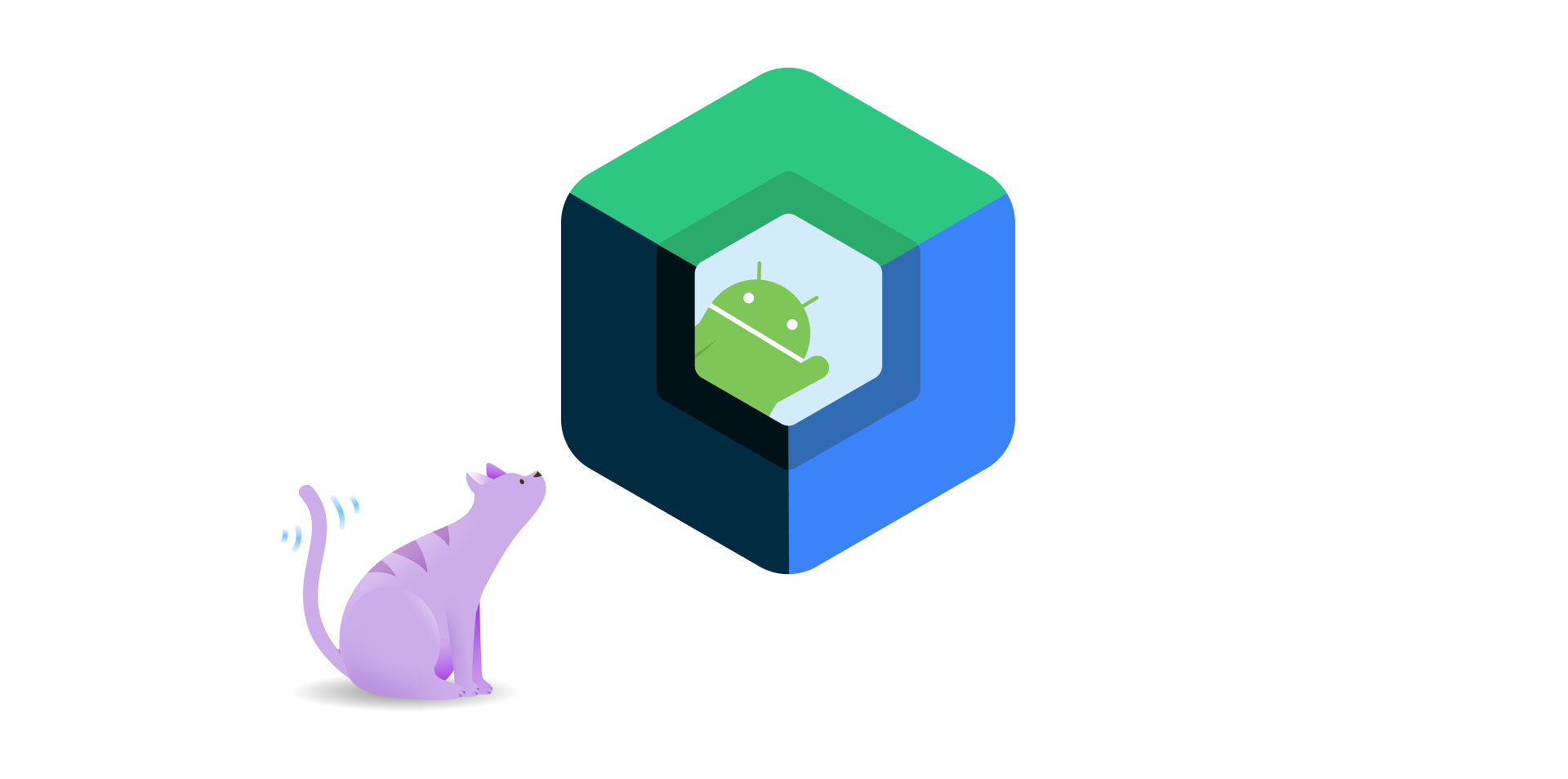
Microsoft Clarity for Mobile Apps now supports apps built with Jetpack Compose, making it easier for developers to monitor and improve their Jetpack Compose UIs.
What is Jetpack Compose?
Jetpack Compose is a modern toolkit introduced in 2021 for building native Android UIs using declarative Kotlin code. It often simplifies and accelerates UI development by enabling developers to write less code, use powerful tools, and benefit from built-in support for Material Design, dark theme, animations, and more. Jetpack Compose is compatible with existing Android views and libraries and allows developers to adopt it gradually and incrementally.
How does Microsoft Clarity support Jetpack Compose?
Microsoft Clarity compose SDK2.5.0 automatically detects and tracks Jetpack Compose components and events, such as clicks, scrolls, and gestures. It also captures the state and properties of Jetpack Compose components, such as text, color, size, and visibility. By integrating the Clarity-compose SDK into an app, developers are able to view and replay Jetpack Compose UIs in the Clarity dashboard and analyze how users interact with them.
Any features or support available in the corresponding clarity version also apply to the clarity-compose version. For example, clarity:2.5.0 supports Android API levels 29-34 inclusive. The same applies to clarity-compose:2.5.0. To apply masking, you can use the special masking/unmasking modifiers.
Add Clarity to your site today!
Use our insights and analytics to wow your website visitors!
If you haven’t heard yet, we’ve built a suite of Copilot features within Clarity to make data analysis easier and faster for you and to help you skip directly to the important info. These features all incorporate generative AI through Large Language Models (LLMs), the same technology that underpins ChatGPT.
With the recent announcement of Copilot Chat, we sat down with Senior Software Engineer Amr Bekhiet who leads the development of Copilot in Clarity to learn more about his role, some of his favorite features and the future of AI.
Hello Amr! Thanks for taking the time to chat! Can you tell us a little about yourself, your role on the team, and how long you’ve been with Clarity?
I started as a Summer Software Engineer Intern in 2017. With over five years of full-stack development experience, my expertise includes performance optimization, SEO (search engine optimization), and AI prompt engineering. Passionate about user experience and AI solutions, I have worked across various Bing search teams and transitioned to my current role in 2023.
As a Senior Software Engineer at Microsoft Clarity, I lead the development of Clarity in Copilot. This AI-powered suite helps users understand website visitor interactions through features like session replay insights, heatmap insights, and dashboard chat. My role ensures these features are high-performing, reliable, and of top quality to enhance user experience and stay ahead of industry trends.
I joined the Clarity Team in February 2023.
What does a Senior Software Engineer do on a day-to-day basis?
A Senior Software Engineer’s Day involves a mix of technical and leadership tasks, such as:
Coding and Development: Writing, testing, and debugging code.
Project Technical Management: Leading project features to ensure they meet deadlines.
Collaboration: Working with engineers, designers, and product managers.
Code Reviews: Ensuring code quality and best practices.
Mentorship: Guiding junior engineers.
Problem-Solving: Resolving technical issues.
Continuous Learning: Staying updated with the latest technologies.
Overall, they balance hands-on coding with strategic planning and team leadership to deliver successful project features!
Can you tell me about your role in helping develop Copilot features within Clarity?
As the lead engineer for Microsoft Clarity Copilot, I drive the creation and integration of AI-powered features. I ensure these features are reliable and high performing. I work closely with various teams to define requirements and prioritize responsible AI practices, conducting thorough reviews to ensure ethical and beneficial solutions. We ship features with automatically generated evaluation reports to monitor AI quality and address issues promptly.
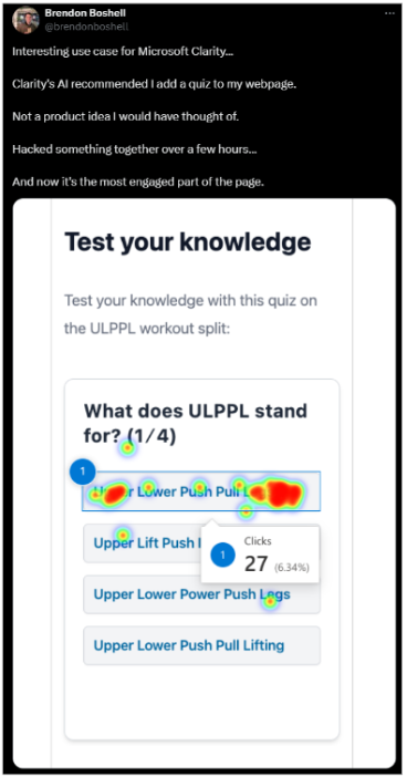
Which Copilot feature is your favorite?
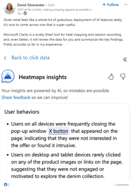
My favorite feature is the heatmap AI-based insights. These insights provide valuable information on how visitors interact with website pages, summarizing data from various heatmap types like rage clicks, dead clicks, and error clicks across all devices. This helps users make data-driven decisions to improve user experience.
Here is one of my favorite tweets from a customer about heatmap insights:
How long did these features take to build?
Building these features took several months, involving stages like planning, defining requirements, development, testing, and thorough reviews. Collaboration with various teams was key to ensuring each feature was well-integrated and aligned with user needs.
Is there anything coming in a future product release that you can talk about or that will get people excited?
While I cannot share specific details, we are working on several exciting new features that will enhance Microsoft Clarity Copilot’s capabilities, making it even more powerful and user-friendly. We are focused on detecting issues and gaining insights based on generative language models, with the next step being to empower customers to act upon those insights.
What is your favorite part about working on the Clarity team?
My favorite part is seeing how our AI-powered features make a real difference for our users. It is incredibly rewarding to know that the tools we develop help people understand and improve their websites more effectively. I also love the collaborative aspect, working with talented teams across different disciplines to bring innovative ideas to life. Plus, the commitment to responsible AI ensures we are creating ethical and beneficial tools. It is great to be part of something that has such a positive impact!
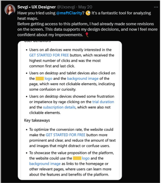
Here are a few posts from our users showing how Copilot can make a difference:
Finish this sentence: Generative AI is going to…
Revolutionize the way we interact with technology, making it more intuitive, personalized, and efficient.
What is a fun fact that most people do not know about you?
A fun fact is that I had one of the longest internships at Microsoft and got my offer right after my graduation, at some point, I was called “The intern who never left.”
Thanks Amr for taking the time to share with us some awesome insights into how Copilot in Clarity came to be!
If you haven’t read up on all of our Copilot features so far, you can check them out in our recent blog post here!
Follow us on X, Instagram and LinkedIn for all product and industry updates and so you can keep track of what’s coming next from our Clarity team!
Add Clarity to your site today!
Use our insights and analytics to wow your website visitors!
If you’re a food blogger aiming to enhance your website, boost engagement, and possibly increase your ad revenue, it’s time to turn your attention to Clarity’s latest feature, the Recipe Widget. This tool is designed to provide comprehensive insights into how your audience interacts with your recipe posts and cards, allowing you to make strategic improvements that could elevate your blog’s performance.
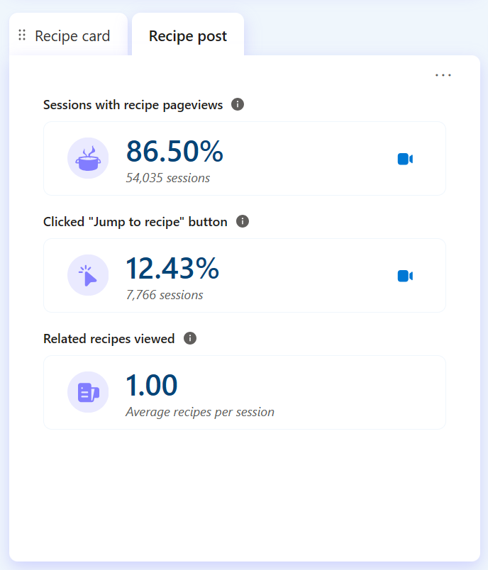
Optimize Engagement with Recipe Post Metrics
The Clarity Recipe Widget doesn’t just count views; it dives into the analytics of your recipe posts. By monitoring key performance indicators such as the number of sessions, clicks on the “Jump to Recipe” button, and views on related recipes, this tool helps you understand the audience’s interaction with the narrative of your recipes. You can also access session recordings to see exactly how visitors navigate your posts. As one blogger noted, “Even though I do a lot of social media, it leads to few views on the blog, and that’s where the money is… It would be good to know if a new recipe is getting traffic from Google or Instagram; I can prioritize my outreach by source.“
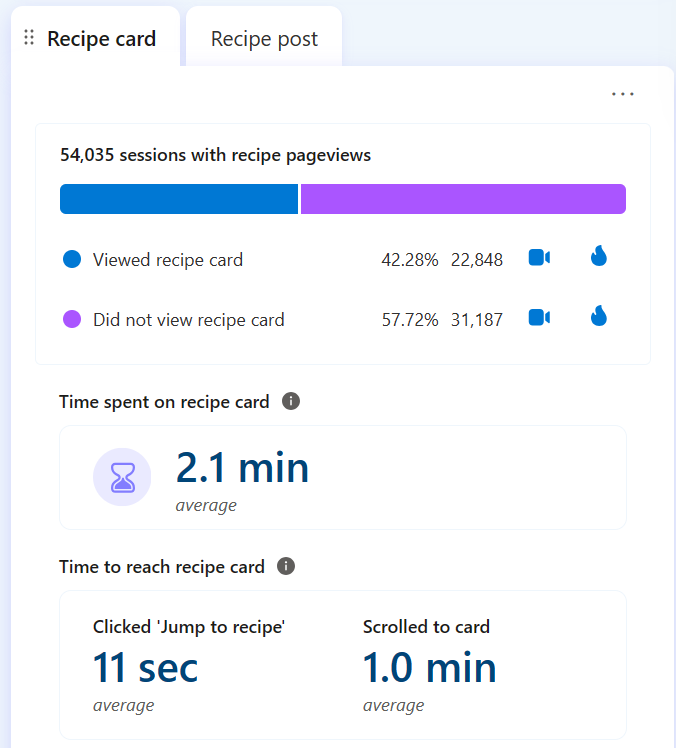
Deep Dive with Recipe Card Metrics
The detailed, step-by-step section of your posts—your recipe cards—are also under the lens. Track not only the number of views but also gather insights on user behavior with heatmaps and recordings. Discover if your content’s length or style affects engagement and monitor how long it takes users to find the recipe card, whether they click directly or scroll through the post. This data could be vital in restructuring your content layout for better visibility and engagement.
“One of my key metrics is to see organic versus social media traffic distribution – GA4 has made this hard,” a user shared in a recent study we conducted with some top food bloggers around the world.
With Clarity, you gain clearer insights, allowing you to refine your traffic strategies effectively.
Leverage Data to Elevate Your Content
With the Clarity Recipe Widget, you can analyze user interaction data to make informed decisions that refine your blog posts. If you find that users linger before reaching the recipe card, consider making it more prominent or shifting it higher on the page. Utilize session recordings and heatmaps to understand what content captivates your audience, helping you brainstorm other appealing recipes.
Monetize Your Food Blogging Efforts
Beyond optimizing content, the Clarity Recipe Widget aids in monetizing your blog more effectively. Understanding what attracts and engages your audience can prove invaluable when negotiating with advertisers or choosing the right affiliate products to promote.
Common monetization methods for food bloggers:
Advertising: Generate revenue through direct ad placements or networks like Google AdSense.
Affiliate Marketing: Earn commissions by promoting products or services relevant to your audience.
Sponsored Posts: Collaborate with brands that resonate with your followers for mutual benefits.
Armed with detailed metrics and insights, you can demonstrate to potential advertisers the value and engagement of your content, thereby attracting more lucrative deals.
Why Use the Clarity Recipe Widget?
Check out the Clarity Recipe Widget and propel your food blog to “egg-strordinary” heights. It’s not just a tool; it’s a must-have feature for bloggers focused on fine-tuning their content strategy and maximizing their revenue potential. With unique features like detailed analytics and interactive heatmaps—reflecting trends that many recipe sites now share—you’re equipped to stand out in a crowded market.
So why wait? Implement the Clarity Recipe Widget today and watch as your food blog transforms from standard to spectacular, all while boosting your earnings and engagement in the flavorful world of food blogging.