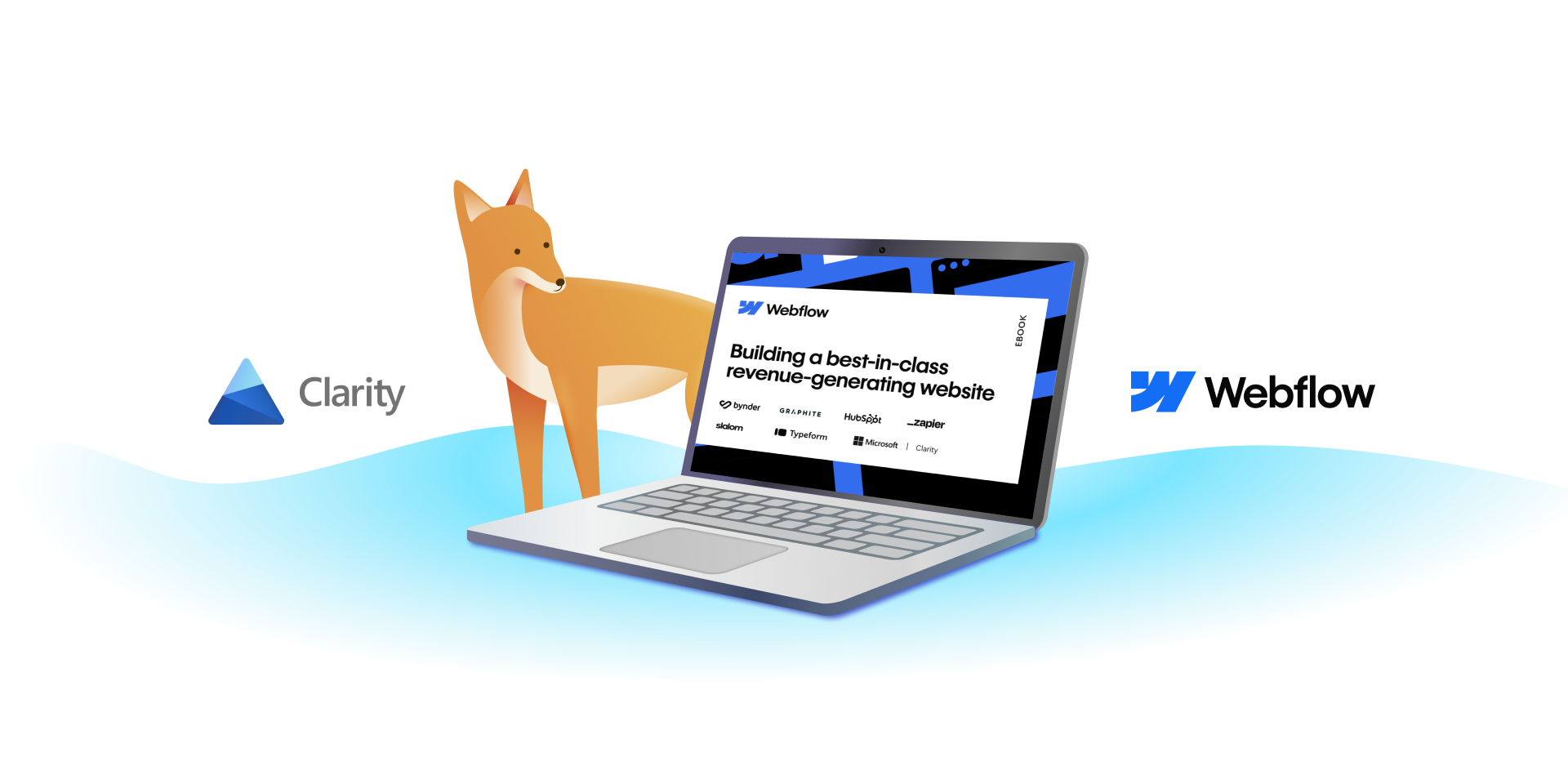
We’re proud to have partnered with Webflow to co-author the ebook Building a Best-in-Class Revenue-Generating Website. This guide combines the expertise of industry leaders to provide actionable insights for creating websites that don’t just look great but also deliver measurable results.
Featuring perspectives from leaders at Slalom, Graphite, Bynder, Typeform, HubSpot, and Zapier, this ebook explores:
Marketing strategies and Webflow Apps to use across the customer journey
Best practices and trends impacting website analytics, optimization, lead generation, and more
How leading organizations use Webflow Apps to build powerful web experiences
Leveraging Data for Smarter Decisions
One of the ebook’s key themes is data-driven decision-making, and Microsoft Clarity stands out as a powerful tool to transform raw data into actionable insights. By analyzing user interactions through heatmaps and session recordings, marketers can pinpoint friction points and areas for improvement. This detailed perspective allows teams to refine their websites and optimize for user experience and conversions.
As Ravi Theja Yada, Director of Product at Microsoft Clarity, puts it:
“To grow and scale, marketing teams need to eliminate guesswork and adopt a data-driven approach. Integrating AI agents, each specializing in distinct marketing tasks, can bridge the skill gaps within the team.”
Actionable Insights at Your Fingertips
The ebook emphasizes the importance of tools like Clarity that go beyond surface-level analytics. Clarity’s features, such as session replays and AI-generated insights, provide marketers with a clear understanding of user behavior. Heatmaps reveal how visitors navigate your website, highlighting elements that capture attention and areas where engagement is lacking.
Moreover, the integration of Clarity with Webflow simplifies the process of linking behavioral insights to web design. The result? Smarter, faster improvements to critical conversion paths.
A Culture of Continuous Optimization
The ebook also discusses fostering a culture of data-driven optimization. By regularly reviewing metrics, heatmaps, and user sessions, teams can stay aligned with evolving user needs and business objectives. The collaborative approach ensures that websites remain adaptable, user-centric, and high-performing.
Unlock the Future of Web Experiences
Looking ahead, Ravi underscores the transformative potential of generative AI for analytics:
“The emergence of generative AI is not just a trend but the future of analytics. The ability to analyze large amounts of data and then make connections, draw conclusions, and suggest improvements will unlock a new level of efficiency and understanding.”
To explore these strategies and more, download the ebook here. Whether you’re looking to improve lead capture, enhance user engagement, or future-proof your website, the combined capabilities of Webflow and Microsoft Clarity can guide you every step of the way.
Over the holidays, I watched the survival show Outlast on Netflix, where contestants are dropped into the Alaskan wilderness with limited supplies to compete for a $1 million prize. Much like Outlast, the internet is a wilderness where businesses are constantly competing for consumer attention and engagement.
In this competitive digital world, your website must leverage every available tool to not just compete, but to truly stand out and effectively convert visits into meaningful actions. Microsoft Clarity has plenty of powerful tools that provide insights needed to navigate and optimize your online environment. With these tools at your disposal, you can increase conversion rates and captivate your potential customers more effectively. In this article I’ll show you how to utilize these tools! Fortunately, in our digital wilderness, the only thing we need to outrun are outdated strategies, not black bears.
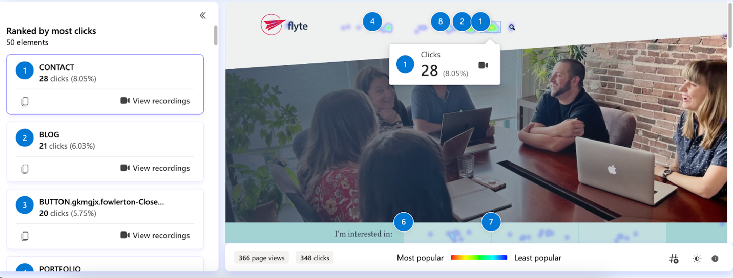
Using Heat Maps to Drive Conversions
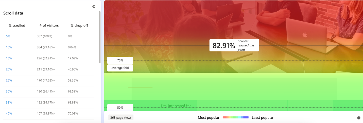
Nobody likes excessive scrolling. If your goal is to drive conversions, one of your top priorities should be making the conversion process as seamless as possible. Clarity’s scroll map tells you precisely where users start to lose interest on a page.
Catch Where Users Stop Scrolling
One of my favorite ways to use this tool is to look for trends of when users are dropping off. If you look at the screenshot below, users are starting to drop around the 15%-20% mark. This is when I would advise a client to pack this early section with essential information but caution them to not overwhelm the user. For example, I would recommend making the calls-to-action (CTAs) clear and concise, whether it’s “Contact Us Today” or “Request a Free Sample.” We want our CTAs to clearly tell users what to do next and guide them smoothly towards a conversion.
Clarity recently released a new feature called attention maps which you learn more about by reading the blog here.
Screen recordings to Understand User Behavior
As someone who loves reality TV, the session recording feature in Microsoft Clarity really speaks to me. Just like watching the strategy unfold on screen, we can observe exactly how users interact with our site. We can see precisely where users hesitate, zoom through, or get stuck. Are they lingering on a section without taking action, or do they leave after reaching a particular point? This might indicate they’re not finding what they need or that the information isn’t hitting the mark.
Find the Highly Engaged Users
Within our digital agency, we often use screen recordings to gain a better understanding of user behavior. To identify highly engaged users, we filter screen recordings to show those who spend more than two minutes on a page and visit at least three different pages. These recordings allow us to observe real-time interactions, where the user’s attention is focused, and what drives their decision-making process. Check out the new user intent filters to learn more!
Clarity’s screen recordings have proven to be helpful in identifying trends and patterns, such as which elements on a page capture attention. It’s easier to see what is working well, whether that’s a particular CTA placement, design feature, or layout choice, and identify areas where improvements can be made to enhance user experience. By analyzing screen recordings, we can not only improve the performance of individual pages but also build a stronger overall customer journey to the conversion point.
Refining Engagement with Click Maps
Click maps in Microsoft Clarity provide direct feedback on what’s catching your users’ attention and what’s missing the mark entirely. Ever wonder if that “Buy Now” button is getting enough attention, or if your “Learn More” link is just floating unnoticed in a sea of page content? Click maps provide the answers by visually representing where users are actually clicking.
Using this data, we can make informed decisions about where to place crucial CTAs and essential conversion-driving information, such as a “Contact” button. If users are most interactive at the top of the page, that’s where key details should go. If a button is in a prominent location but isn’t attracting attention, consider adjusting its color to make it more eye-catching or testing alternative phrasing to better resonate with your audience. These small but strategic changes can significantly improve engagement and drive conversions.
By optimizing the placement, color, and copy of our buttons and links, we ensure nothing vital goes unnoticed. Think of it as setting the stage just right, so when the spotlight hits, every key element shines perfectly.
Using Click Maps to Optimize Landing Pages
We often use this feature on our clients’ landing pages for digital ads. For example, recently while analyzing a client’s landing page for Meta ads, I noticed users were particularly interested in learning about their events and programs. Based on this insight, I created a plan to update the ad copy to highlight these offerings, aiming to attract more qualified leads and boost conversions.
This isn’t just about making things look pretty—it’s about making every interaction on your site as intuitive and compelling as possible, paving the way for more clicks, and ultimately, more conversions.
Combining Clarity with GA4 Insights to Increase Conversion Rates
In Outlast, forming unexpected alliances in the harsh, outdoor environment can mean the difference between victory and elimination. Players in this game have no choice but to rely on each other for survival. This strategy of collaboration for a shared goal isn’t just for survival games, it’s something we can apply directly to digital marketing strategies. By integrating Microsoft Clarity with Google Analytics 4 (GA4), we’re essentially building a powerful alliance designed to outperform and outlast the competition.
Clarity provides a behind-the-scenes look with session recordings and click maps. It’s like getting inside the mind of your website visitors to see what really matters to them, ensuring you don’t just survive, but thrive. This integration allows us to adapt and refine our strategies, much like teams who adjust their strategy during the commercial break, once they see how their initial course of action worked out. By leveraging these combined insights, you can stay one step ahead of the competition, creating content that engages your audience and converts site visitors into loyal customers.
Just as Outlast contestants had to adapt to the Alaskan wilderness to survive, your website must adapt to meet user expectations and guide them along their customer journey. By leveraging Clarity, every click, scroll, and hesitation becomes an opportunity to refine and optimize your digital strategy. In this competitive environment, improving the customer experience and journey is a sure path to outlasting your competition.
Having earned a marketing degree in December of 2023, Roslyn blends a passion for creative marketing with a keen interest in the psychological aspects that drive consumer behavior. When not diving into the latest trends in marketing, Roslyn enjoys discovering new music, though Taylor Swift remains a constant favorite! As a Southern Maine native, the coast is her favorite place to be. Whether it’s a warm day on Wells Beach or hiking scenic trails, she loves spending time outdoors. With college now in the rearview, she is eager to travel and begin new adventures. Driven by a curious mind, Roslyn is ready to immerse herself into the world of marketing with Flyte New Media!
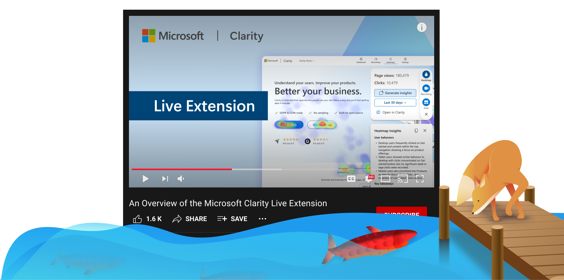
Watch Now: An Overview of the Microsoft Clarity Live Extension
Discover the Clarity Live Extension—your real-time window into heatmaps and session recordings on any page with Clarity tracking. Learn how to install, use, and get instant insights without logging into your dashboard. View live heatmaps, area maps, and recent recordings directly from your browser.
Perfect for quick data checks and deep dives into user interactions. Install it today and see your site’s engagement like never before!
Learn more by watching the video below:
Subscribe to our YouTube channel and follow us on social so you know what’s coming next from the team!
Enjoy!
Supercharge Your CRM: Unlock Game-Changing Insights with Clarity + HubSpot
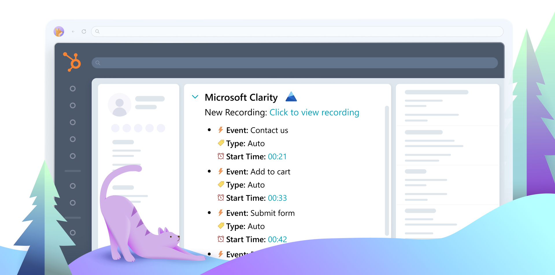
In the fast-paced world of CRM, having a complete view of your contacts’ journeys is essential. Microsoft Clarity’s Smart Events Integration with HubSpot brings website behavior data into your HubSpot dashboard, enabling you to track and analyze key user interactions directly within your CRM. This enhanced integration bridges the gap between website analytics and customer relationship management, giving your team actionable insights to refine user experiences and increase engagement.
What Are Smart Events?
Smart Events are designed to capture specific user interactions on your website by combining multiple data signals into high-level user actions. These can include key events such as “Purchase,” “Contact Us,” or “Add to Cart.”
Access the contact list and select the record of the contact whose data you wish to view. In the activity section, you can examine the smart events listed within HubSpot by expanding the Clarity timeline event card allowing you to explore both predefined and customized events.
Click on a smart event to view the Clarity recording, with the timeline highlighting the exact moment the event occurred.
Analyze and Optimize:
Use these insights to understand user paths that lead to conversions or drop-offs.
Identify friction points in your user experience and address them effectively.
Make data-driven design and content improvements to enhance engagement and drive better conversions.
Why Use Smart Events + Hubspot Integration?
This integration offers a powerful combination of predictive analytics for UX and streamlined workflows. Smart events Integration with HubSpot delivers clear advantages:
Streamlined Analysis: Access direct links to session recordings for faster insights.
Pattern Recognition: Identify trends and behaviors that impact user experience.
Actionable Insights: Turn data into meaningful improvements that enhance business outcomes.
The enhanced smart events Integration with HubSpot makes it easier than ever to unlock the potential of your user behavior data. Log in to your Microsoft Clarity account to explore the integration today. For additional tips and guidance, visit our Smart Events Overview.
Enhance your ability to understand user behavior and take your website optimization to the next level with Microsoft Clarity.
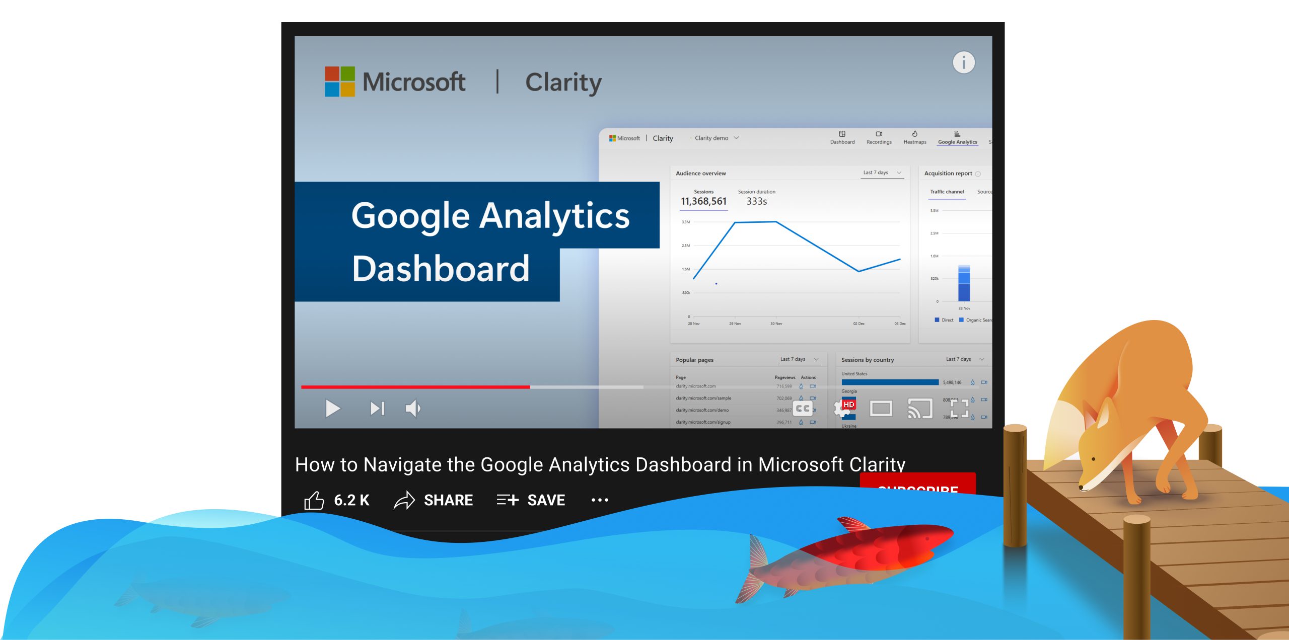
Unlock the power of Google Analytics with Microsoft Clarity! Learn how to seamlessly integrate GA with Clarity, connect your account, and explore key reports like Audience Overview and Acquisition. Plus, gain deeper insights with Clarity’s heatmaps and session recordings to better understand user behavior and optimize your site effectively.
Discover how to streamline your data analysis and get a complete view of your site’s performance. Learn more by watching the video below
Don’t forget to subscribe to our YouTube channel and follow us on social so you know when our next video will drop!
Mobile app functionality is becoming increasingly sophisticated, and the market is flooded with SDKs designed to enhance apps. However, not all SDKs are created equal. In this blog, we’ll explore why the Clarity Mobile SDK stands out as a top choice for mobile app analytics and how it can benefit your app.
What is Clarity Mobile SDK?
The Clarity Mobile SDK is a lightweight, high-performance software development kit that delivers in-depth analytics and insights for mobile apps. With Clarity, developers can monitor user behavior, diagnose performance issues, and improve overall app experiences. It supports:
Integrating the wrong SDK can harm your app’s performance. Poorly designed SDKs may cause slower performance, bugs and glitches, increased crashes and reduced functionality. These issues can lead to user churn and negative reviews. In contrast, a high-quality SDK like Clarity can boost key metrics, including, user retention, engagement and revenue.
1. Lightweight and Efficient: Clarity’s small footprint ensures that it doesn’t slow down your app:
Android SDK Size: 417KB
iOS SDK Size: 977KB
2. Easy Implementation: Integrating Clarity can take just a few minutes. Developers have reported the full integration taking no longer than 20 minutes.
Explore the Microsoft Clarity Settings Page and learn how to manage project details, set up team roles, integrate with Google Analytics and Tag Manager, and configure privacy features like masking and IP blocking. Discover how to customize your setup and explore integrations to enhance your Clarity experience!
Get the most out of your Clarity settings by learning more here:
Don’t forget to subscribe to our YouTube channel and follow us on social so you know when our next video will drop!
Enjoy!
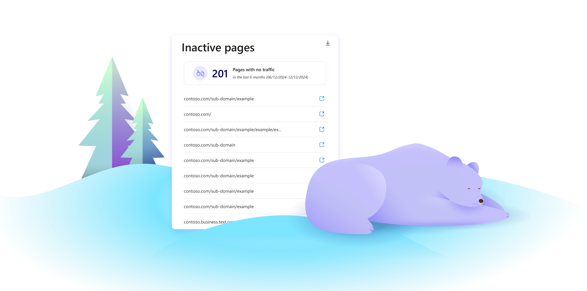
Uncover Hidden Insights: Introducing Inactive Pages in Microsoft Clarity
We are thrilled to announce a new feature for Microsoft Clarity: Inactive Pages. This new feature will help you identify pages on your website that have not been visited in the past 12 months, providing valuable insights that are currently only available through expensive SEO tools.
What are Inactive Pages?
Inactive Pages are defined as pages on your website that have not received any visits in the past 12 months. Identifying these pages can help you understand which parts of your site are underperforming or no longer relevant to your audience.
Note: Inactive pages are only available for projects with sitemaps
Why Inactive Pages Matter
Understanding Inactive Pages is crucial for several reasons:
Uncovered Analytics Area: This is a significant area in analytics that is not covered by any behavioral analytics tool. Traditionally, only SEO tools have provided this information.
Cost Savings: Website owners often pay substantial amounts to auditors and tools to get this information. With Clarity, you can access it easily and for free.
Benefits of Using Inactive Pages in Clarity
Optimize Content: Identify and remove or update underperforming pages to improve overall site performance.
Improve SEO: Boost search engine rankings by eliminating outdated or irrelevant pages, consolidating valuable content, and ensuring a streamlined site structure that search engines can easily crawl.
Enhance User Experience: Focus on content that matters to your users, ensuring a more engaging and relevant experience.
Save Costs: Reduce the need for expensive third-party tools and auditors by leveraging Clarity’s built-in capabilities.
Increase Engagement: By addressing inactive pages, you can ensure your site remains dynamic and engaging, leading to higher user retention and satisfaction.
Access Inactive Pages Report: Navigate to the Inactive Pages section in your Clarity dashboard.
Analyze Data: Review the list of pages that have not been visited in the last 12 months.
Take Action: Decide whether to update, remove, or repurpose these pages based on their relevance and performance.
Default tab: If you would like to set inactive pages as the default tab, go to Card data -> Customize dashboard -> Select default tab. Choose Inactive pages.
The Inactive Pages feature is a game-changer for website analytics, providing valuable insights that were previously difficult and costly to obtain. Try it out now and see how it can help you optimize your website and enhance user engagement!
Watch Now: How to Use the Microsoft Clarity Data Export API
The Data Export API lets you download Clarity dashboard data automatically, allowing for deeper analysis and integration with applications. Whether you’re evaluating a website redesign or measuring a marketing campaign’s impact, this API brings Clarity insights directly into your dashboard.
Unlock the power of data with Microsoft Clarity’s Data Export API!
Make the most of Clarity’s Data Export API by learning more here:
Don’t forget to subscribe to our YouTube channel and follow us on social so you know when our next video will drop!
Enjoy!
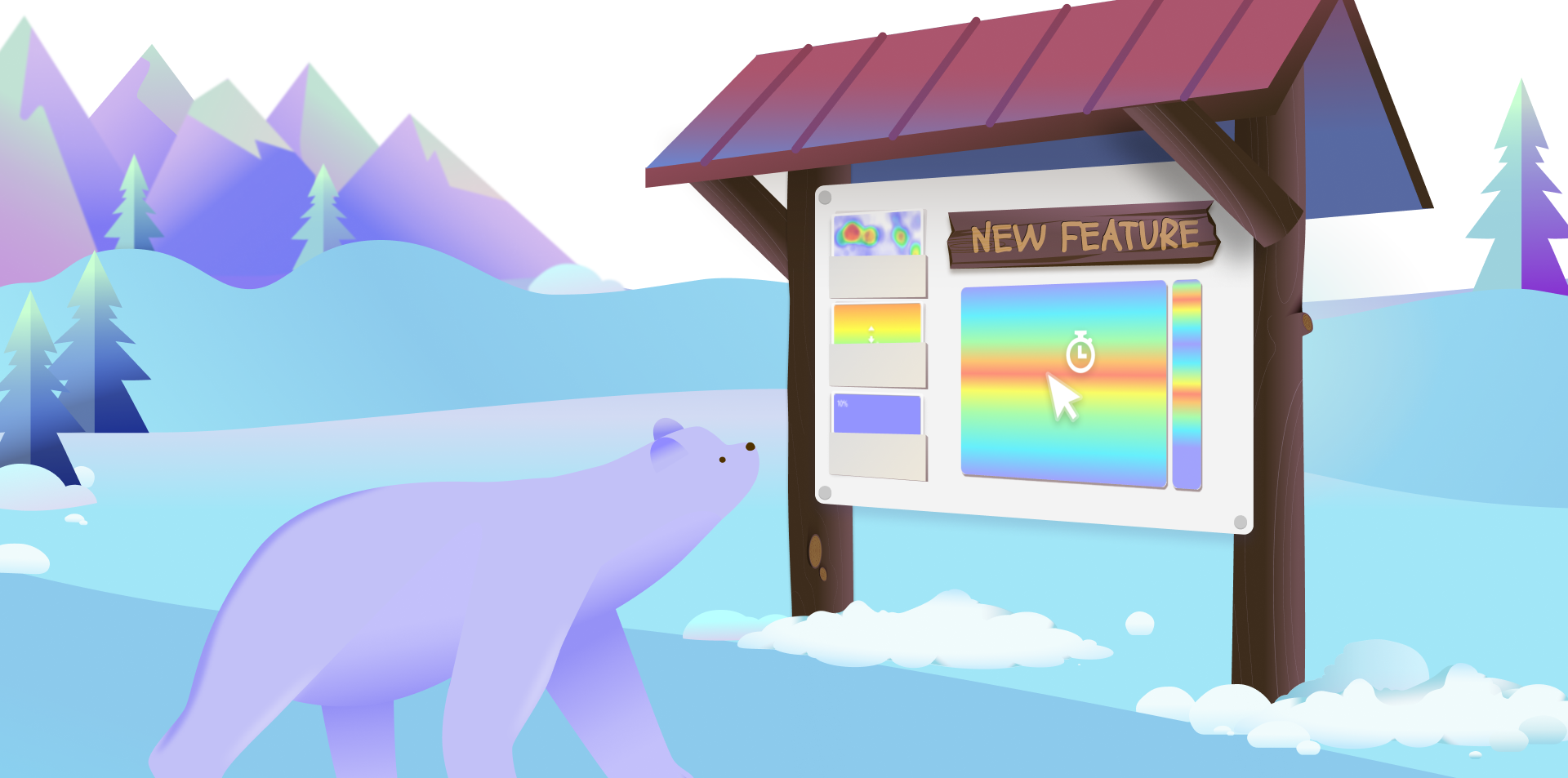
Introducing Attention Maps: Unlock Deeper Insights with Microsoft Clarity
Understanding user behavior is critical for optimizing your website’s performance. Microsoft Clarity’s new Attention Maps feature offers a fresh perspective on how visitors interact with your pages, helping you fine-tune your user experience and maximize engagement.
What Are Attention Maps?
Attention Maps visualize where users spend the most time on your webpage. By highlighting sections with warmer or cooler colors, they reveal which parts of your content captivate your audience’s attention and which areas may need improvement. This granular insight helps you answer key questions like:
Are users engaging with the most important elements on your page?
Are visitors missing critical CTAs or information?
These insights empower data-driven decisions, from tweaking content placement to refining page layouts.
Key Features of Attention Maps
Attention Maps provide detailed metrics that bring clarity to user engagement patterns:
Average Time Spent: Measure the average time users spend on specific parts of your page. Hover over any section to get precise data.
Percentage of Session Length: Understand how long users focus on a section relative to the overall session length.
Heatmap Visualization: Warmer colors indicate more time spent, while cooler colors show areas with less time spent.
How to Use Attention Maps
Install the Clarity Tracking Code: Ensure the Clarity tracking code is installed on the pages you want to analyze. Follow the Setup Process for step-by-step guidance.
Access Attention Maps: Navigate to the Heatmaps section in your Clarity dashboard and select Attention Maps. Use the left-hand panel to explore data such as:
% Scrolled: View page sections based on scroll depth.
Avg Time Spent: Identify areas where users spend the most time.
% of Session Length: Assess user focus relative to the total session.
Analyze and Optimize:
Focus on sections with cooler colors to improve visibility or time spent.
Test layout changes to direct attention toward high-priority elements like CTAs or key content.
Why Use Attention Maps?
Whether you’re optimizing an e-commerce product page, refining your blog layout, or improving form submissions, Attention Maps provide actionable insights to:
Enhance page usability
Boost conversions
Drive better outcomes for your business
Enhance Your Understanding with Clarity’s Heatmaps
Attention Maps are part of Clarity’s robust Heatmap suite, which also includes Click Maps and Scroll Maps. Together, these tools offer a comprehensive view of user interaction, enabling you to craft experiences that resonate with your audience.
Get Started Today
Ready to uncover what truly holds your audience’s attention? Sign in to your Microsoft Clarity account and explore Attention Maps now. For more tips on maximizing your insights, check out our Heatmap FAQ and Heatmaps Overview.
Unlock Deeper Insights with Microsoft Clarity’s Google Ads Integration
The new Google Ads integration with Microsoft Clarity, first launched in private preview in December 2024, is now generally available to all users! This integration connects Google Ads performance metrics with Clarity’s behavioral insights, offering a comprehensive way to analyze and optimize advertising campaigns.
Beyond Metrics: Understanding User Behavior
By combining Google Ads data with Clarity’s rich behavioral analytics, you can move beyond surface-level metrics to truly understand user behavior after ad clicks. View session recordings to observe how visitors navigate your site and explore heatmaps to visualize engagement patterns. These insights help identify friction points, optimize landing pages, and refine strategies to boost conversions. Understanding user behavior allows you to take targeted actions to reduce drop-offs and enhance return on ad spend (ROAS).
Key Features of the Integration
The integration links Google Ads campaign-level data with Clarity’s behavioral insights. Key features include:
Viewing session recordings and heatmaps at the campaign level
Filtering Clarity dashboards by Google Ads campaigns
And monitoring Google Ads metrics like:
Impressions
Click-Through Rates (CTR)
Cost-Per-Click (CPC)
Cost-Per-Action (CPA)
and Conversion Rates (CVR)
How Clarity Enhances Campaign Optimization
By leveraging Clarity’s advanced tools, advertisers can achieve:
Heatmap Comparisons: Identify high-engagement elements to replicate success.
Session Replay Summaries: Save time with streamlined analysis.
Funnel and Smart Event Comparisons: Detect conversion issues with precision.
A/B Testing Insights: Determine the best-performing variations for campaigns.
Performance Troubleshooting: Diagnose issues such as slow page load times.
These features not only support Conversion Rate Optimization (CRO) but also enhance user experience and increase the likelihood of desired actions.
How to Get Started
Getting started with the integration is quick and simple:
This integration simplifies ad performance analysis, enhances user engagement insights, and empowers smarter marketing decisions. Try the Google Ads integration today and transform your marketing strategies!
Stay tuned for updates as we continue expanding Clarity’s capabilities to unlock deeper advertising insights!
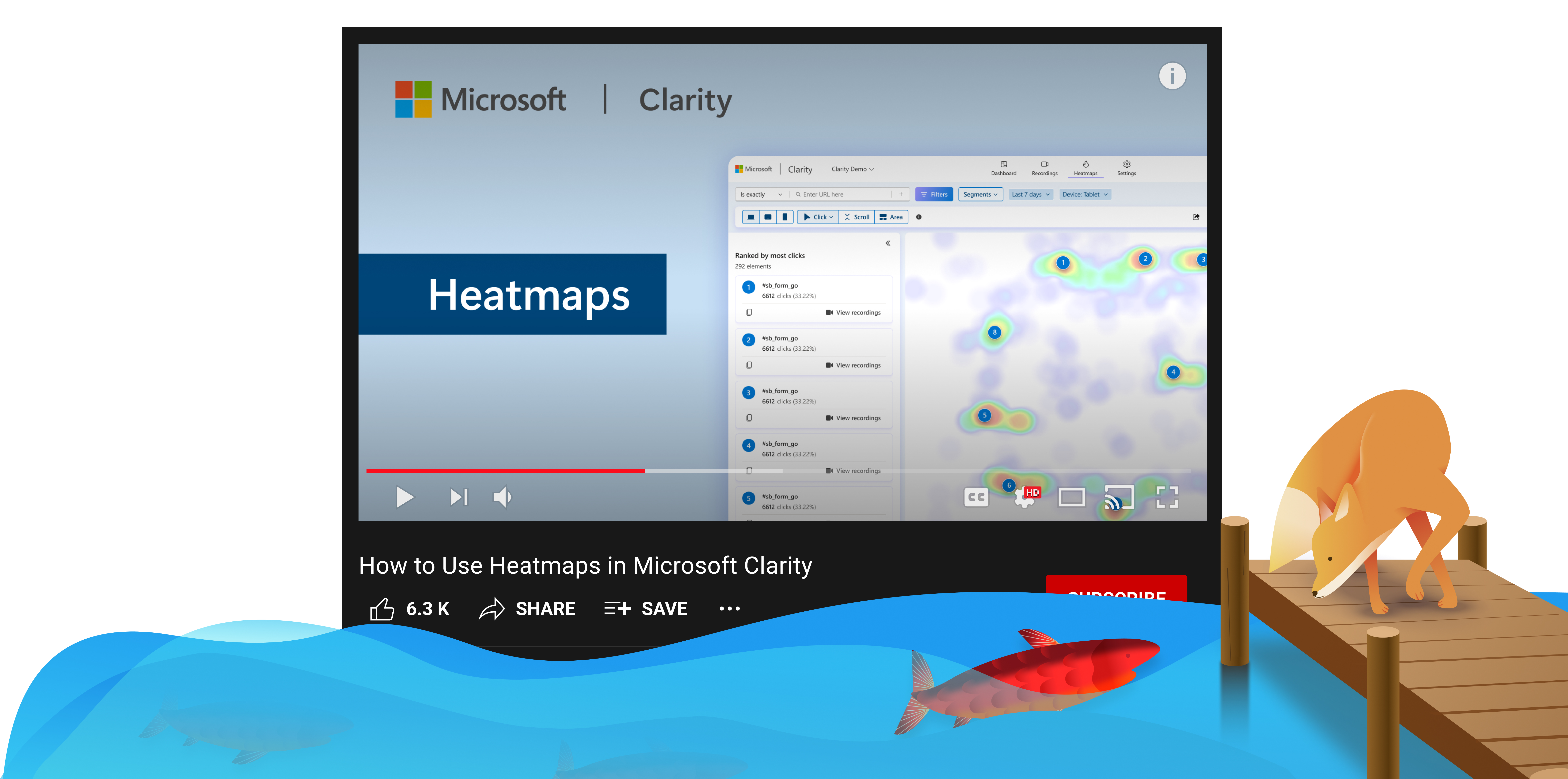
Heatmaps in Microsoft Clarity visually represent user interactions like clicks and scrolls, helping you optimize your site. Learn how click maps reveal popular areas, scroll maps show user engagement, and area maps track clicks in specific regions.
You can compare heatmaps across devices, perform A/B testing, and switch between screenshots to analyze different page versions. Filters allow you to focus on specific user segments, and session recordings offer deeper insights. Plus, our AI Copilot summarizes key data, making it easier to spot trends and issues.
For more information on optimization using Heatmaps watch the video below:
Don’t forget to subscribe to our YouTube channel and follow us on social so you know when our next video will drop!