How to Make the Most of Your Heatmaps Data

How to Make the Most of Your Heatmaps Data

Heatmaps are a powerful tool for understanding how users interact with your website. By visually representing user behavior, heatmaps reveal critical insights about where visitors are engaging, where they drop off, and how they navigate through your site. Whether you want to optimize the placement of key elements, improve user experience, or boost conversion rates, effectively using heatmap data can be a game-changer.  

We’ll explore different types of heatmaps and show you how to leverage the insights they provide to make informed decisions that drive better results for your website. 

What are heatmaps? 

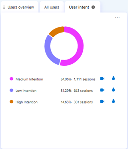
Heat maps provide insights into how visitors engage with your website by showing where they scroll, stop, and interact. Analyzing these patterns allows you to identify high or low user engagement areas. You’ll see that the highest engagement areas are marked in red while the lowest engagement areas are marked in blue.  

Microsoft Clarity categorizes heatmaps into four different types: 

  • Scroll 
  • Click 
  • Area 
  • Conversion  

It’s important to note that Conversion heatmaps are only available on Shopify websites. 

With these heatmaps, you can use filters, compare heatmaps for the same page on different dates, and use Copilot to receive AI-generated summaries of them. You’ll receive insights into user behavior patterns and suggestions based on these. 

Heatmap insights can guide you in strategically placing elements on a page to enhance visibility, boost user engagement, and improve conversion rates. Let’s get into each type and how we can put this data to use.  

Scroll heatmaps 

Scroll heatmaps show you how far down a user scrolls on a page. You’ll see the average fold, or what loads on a page before they scroll. You’ll also be able to look at the percent scrolled, the number of visitors that visited that part of the page, and the percent drop off per section.  

Using Scroll heatmaps to improve user engagement 

Plenty of websites overlook the importance of the space above the fold. This is the area where you should be placing your most important content. The scroll heatmap on Clarity will show you exactly where that is and the drop-off of users once they load the page.  

Often, websites use a hero image that’s way too big and has nothing but an H1 and an image when a user first loads the page. This isn’t helpful and can deter people away from that page and even the site as a whole.  

It’s best to place the page’s most important content loads above the fold, whether that’s a paragraph, form, call-to-action button, etc. Use that space to give users what they are looking for and if possible, direct them to the next place they want to go.  

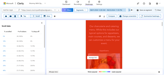
You can also use the percent scrolled data to find out what content users are not reaching on a page. If most users aren’t reaching something you believe they will find useful, then experiment with changing the layout of the content.  

Click heatmaps 

Click heatmaps show you elements on a page with high engagement. Elements that users are constantly clicking on will show up in red, while lesser clicked elements will be blue. When you look at this section, you can toggle between the following click data: 

  • All clicks 
  • Dead clicks 
  • Rage clicks 
  • Error clicks 
  • First clicks 
  • Last clicks 

This information is crucial to seeing which parts of a page draw user attention the most. You can use this to lead them to other pages on the site, to fill out a form, give you a call, etc.  

Using Click heatmaps to improve user engagement 

Use your click heatmap data to find the following: 

  • Broken links 
  • Elements that look clickable, but aren’t  
  • Most clicked elements on the page 
  • Least clicked elements on the page 

We recommend using the dead clicks and rage clicks data to find out which parts of a page or text users think should lead to some desired action but don’t. For example, in my case study of a home building client, I found out that users who visited the floorplans page clicked on the individual floorplans titles and expected to be directed to a page specific to that floorplan.  

The basic information for each floorplan was on that page, but users wanted more information. Seeing this data led my team to create individual floorplans and we received way fewer dead clicks on the general floorplans page after that. This helped us continue to lead our users down the funnel and give them the information they needed to decide whether they wanted to contact our client.  

Below, is a click heatmap example from a charcuterie and catering business.  

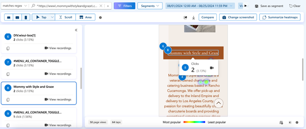
You can see that there were 2 clicks on the company’s name during the month of August. This is a small business site with not a lot of visitors, so the 5th-8th most clicked elements on the page all have 2 clicks.  

Since users are scrolling down to this part of the page and a couple of them ended up clicking on the name, we might want to test placing a different element here. It might be best to try placing a call-to-action button that leads to the catering business’s menu instead and seeing how well that does.  

Use your click data to run A/B tests and find out what hypotheses improve user behavior metrics.  
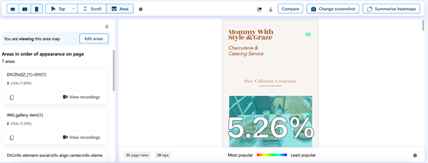
Area heatmaps  

Area heatmaps show you the total clicks in any given area on a page or groups of pages. This is similar to click heatmap data, but instead, you will receive a click-through rate (CTR) per area and can see the data for all elements within that area.  

Using Area heatmaps to improve user experience

This type of heatmap is incredibly useful in narrowing down your focus to specific sections on a page. Let’s say there is a CTA section on a service page that includes a call button, a contact form button, and a link to the business’s address. You can view the CTR for the entire section and then narrow it down to those specific elements to see which CTA is the most popular.

You then may want to test changing the order of the CTAs and see if that has an impact on which one is the most effective. Or if you want to receive more phone calls vs form submissions, you might want to remove the contact form button from the area and place it elsewhere.

Conversion heatmaps

This heatmap exclusive to Shopify sites, shows the percentage of sessions that led to a purchase when a user clicks within a selected area. It’s important to know which pieces of content and widgets lead users to make a purchase, and with these heatmaps, you can now know where to focus your efforts.

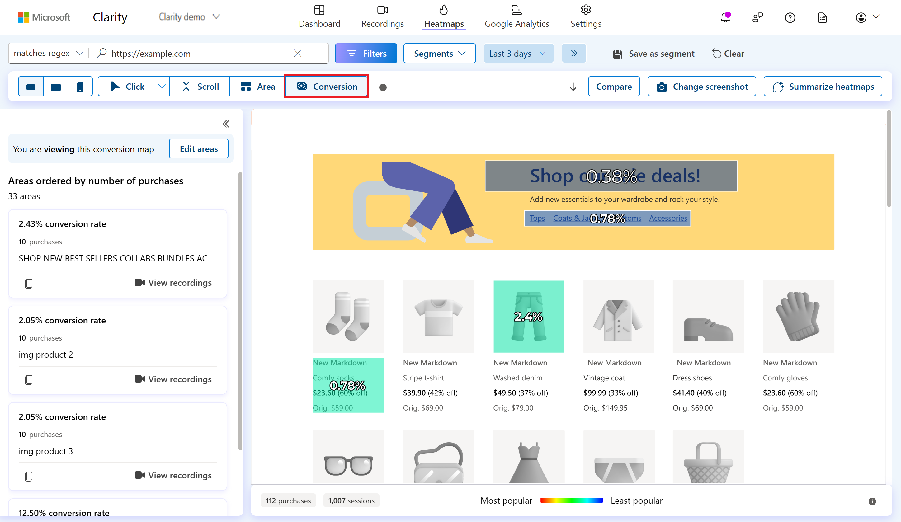
Using Conversion heatmaps to improve conversion rates

Check out this data on your collection pages and see which products are driving the most conversions and which ones are driving the least. You can try testing new images for the lesser-clicked products or test the placement of certain products on a page to see if that impacts conversion rates.

Turning Insights into Action

Heatmap data empowers you to make data-driven decisions that align with your goals.

By analyzing scroll, click, area, and conversion heatmaps, you can optimize your site to enhance user engagement, improve navigation, and ultimately increase conversion rates. Start using these insights today to lead to a more effective and user-friendly website.


Celeste Gonzalez started her SEO career while blogging about her journey as a first-generation college student at U.C. Davis. After completing her Bachelor of Science in Managerial Economics, she joined RicketyRoo as an SEO Specialist. After a brief but impactful eight-month tenure as an SEO Specialist, Celeste quickly ascended to the role of SEO Strategist, where she shaped innovative strategies for nearly two years. Celeste now spearheads RooLabs, the cutting-edge SEO testing division at RicketyRoo, where she actively engages with the SEO community by sharing her experiences—highlighting achievements and challenges.

Watch Now: Microsoft Clarity’s Approach to Data Privacy

Watch Now: Microsoft Clarity’s Approach to Data Privacy

Our next video up talks all about our approach to data privacy.

See what features can help you protect your site visitors’ data.

  • IP Blocking: Learn how to block specific IP addresses to prevent Clarity from tracking internal data
  • Content Masking: Discover how to mask sensitive information using preset options or custom settings
  • Cookie Management: Find out how to ensure cookies are only placed after user consent, aligning with privacy laws.

Watch now to ensure your use of Clarity is privacy-compliant!

Don’t forget to subscribe to our YouTube page and follow us on social so you know when our next video will drop! 

Enjoy!

We’re Jumping into Something New! Announcing the Official Microsoft Clarity YouTube Channel 

We’re Jumping into Something New! Announcing the Official Microsoft Clarity YouTube Channel 

Hello Clarity fans! We are excited to announce the launch of our official YouTube channel and a series of Clarity tutorial videos so you can learn more about our product, its features and how you can use them from one of the members of our team!

We will be releasing our tutorial videos throughout the rest of this year for you to watch and learn more about your favorite behavioral analytics tool! 

We will cover the following topics in our tutorial videos:

  • What is Microsoft Clarity? 
  • Microsoft Clarity’s Approach to Data Privacy 
  • An Overview of Copilot in Microsoft Clarity
  • How to Setup Microsoft Clarity for Your Website  
  • How to Setup Microsoft Clarity for Your Mobile App 
  • Navigating the Microsoft Clarity Dashboard
  • Utilizing Visitor Profiles in Clarity 
  • Using Filters in Microsoft Clarity
  • How to Utilize Custom Filters in Microsoft Clarity 
  • An Overview of the Microsoft Clarity Watchlist 
  • An Overview of Smart Events in Microsoft Clarity 
  • Utilizing Funnels in Microsoft Clarity 
  • An Overview of E-Commerce Features in Microsoft Clarity 
  • How to Use Heatmaps in Microsoft Clarity 
  • An Overview of Microsoft Clarity Insights 
  • An Overview of Session Recordings in Microsoft Clarity 
  • How to use the Microsoft Clarity Data Export API 
  • An Overview of the Settings Page in Microsoft Clarity 
  • How to Navigate the Google Analytics Dashboard in Microsoft Clarity 
  • An Overview of the Microsoft Clarity Live Extension 

Check out our first video below and let us know what you think in the comments section!

Make sure to subscribe to our YouTube page and follow us on social so you know when our next video will drop! 

Enjoy!

User intent metric: Understand engagement at a glance

User intent metric: Understand engagement at a glance

Ever wondered if the new traffic coming onto your website is “good traffic”? Or if you’re getting “better” users from one campaign versus another?  

Clarity’s newest ‘User intent’ feature answers these questions and more. We group your website traffic into three categories based on a combination of user behavior signals, enabling you to quickly identify your most promising -and unpromising- website visitors.  

How does it work?  

Using a combination of signals, like session length, user clicks and achieving key smart events, Clarity categorizes your website traffic into one of three buckets: 

  • Low Intent Sessions: These are brief interactions where visitors show minimal engagement, either spending less than 5 seconds on the site or staying longer without interacting (no clicks or scrolls). This could indicate issues like bot traffic or a mismatch between the content and the audience. 
  • Medium Intent Sessions: These sessions involve moderate engagement, with users spending more than 5 seconds on the site and interacting to some extent—either through clicks, scrolls, or minimal key smart events. These visitors show some interest but do not necessarily convert. 
  • High Intent Sessions: These sessions reflect strong engagement, with users spending over 5 seconds on the site and actively interacting through clicks and key smart events, indicating a high level of interest that often leads to conversion or near conversion. 

Where can I find it?  

You can find the User Intent module behind the User Overviews section in the Clarity dashboard and apply filters across all three buckets.  

We recommend filtering to interested campaigns or referrers, and then looking at the User Intent module to understand the breakdown.  

For more details, please visit our documentation here

Conclusion 

Our new User Intents feature is a great way to understand at a glance what quality of traffic is on your website. High percentage of high intent users indicate your site is performing well and attracting the right user base. High percentage of low intent users indicate there is room for optimization either on your site or with your targeting.  

Let us know how you like using this on X @msftclarity!  

Boost Your SEO: A/B Testing with IndexNow and Microsoft Clarity

Boost Your SEO: A/B Testing with IndexNow and Microsoft Clarity

In the ever-evolving world of digital marketing, staying ahead of the competition requires constant innovation and adaptation. One of the most effective strategies to enhance your website’s performance and search engine optimization (SEO) is A/B testing. By comparing two versions of a webpage to see which one performs better, you can make data-driven decisions that significantly improve your site’s user experience and search engine rankings.  

Why A/B Testing is Important for SEO 

  1. Data-Driven Decisions: A/B testing allows you to base your decisions on actual data rather than assumptions. By testing different content elements on your webpage, such as headlines, key words, images, or call-to-action buttons, you can identify what resonates best with your audience. 
  1. Improved User Experience: A better user experience often leads to higher engagement, lower bounce rates, and increased conversions. A/B testing helps you fine-tune your website to meet the needs and preferences of your visitors, which in turn can boost your SEO rankings. 
  1. Increased Conversion Rates: By identifying the most effective elements of your webpage, A/B testing can help you optimize your site for higher conversion rates. This means more leads, sales, or whatever your conversion goals may be. 
  1. Reduced Bounce Rates: A well-optimized page that meets user expectations will likely have a lower bounce rate. Search engines consider bounce rates as a ranking factor, so reducing them can positively impact your SEO. 
  1. Adaptability: The digital landscape is constantly changing. A/B testing allows you to stay agile and adapt to new trends and user behaviors, ensuring your website remains relevant and competitive. 

How IndexNow Can Help 

IndexNow is a powerful tool that can significantly enhance your A/B testing efforts. Here’s how: 

  1. Instant Indexing: One of the biggest challenges in SEO is getting your changes indexed quickly by search engines. IndexNow provides a powerful solution by allowing you to instantly notify search engines of any updates or changes to your website. This means your A/B test variants can be reflected in search engine rankings much faster. Combined with Clarity’s insights into user behavior and engagement, you can make more informed decisions to optimize your site’s visibility and performance.  
  1. Easy Adoption: IndexNow integrates seamlessly with various SEO tools such as Yoast, SEOPress, and Ahrefs. It also supports a range of content management systems (CMS) and plugins, including WordPress, Wix, and Duda. For a full list of supported tools and plugins, visit bing.com/indexnow/getstarted
  1. Comprehensive Insights: Through both top-level metrics and detailed reports, website owners have a comprehensive view of IndexNow submitted URLs’ indexing performance that allows them to make more informed, strategic decisions to enhance their online visibility. With the user-friendly interface on Bing Webmaster Tools, they can easily see which URLs have visibility in search engines, accurately track when their tests are active, and measure the effectiveness of different approaches. 

Clarity and A/B Testing 

Microsoft Clarity provides valuable insights through session recordings and heatmaps and integrates seamlessly with A/B testing platforms like AB Tasty and Kameleoon enhancing your ability to analyze and optimize your website. 

AB Tasty Integration: 

Session Recordings and Heatmaps: By integrating Clarity with AB Tasty, you can track experiments and view session recordings and heatmaps for each variation. This helps you understand how users interact with different versions of your webpage and identify the most effective elements. 

Easy Setup: Activating the integration is straightforward. Once enabled, Clarity automatically sends campaign information (campaign ID, variation ID, and visitor ID) to your Clarity account, allowing you to analyze the data directly within AB Tasty. 

Kameleoon Integration: 

Comprehensive Insights: Combining Kameleoon’s A/B testing and personalization platform with Clarity provides a holistic view of user behavior. You can track experiments and use Clarity’s session recordings and heatmaps to compare variations and make data-driven decisions. 

Flexible Activation: You can activate Clarity on Kameleoon campaigns in multiple ways, including through the Graphic editor or Code editor. This flexibility ensures that you can easily incorporate Clarity into your existing workflow. 

The underlying way to speed up A/B testing is getting more data faster or getting more users to your site, more often. In a recent blog post from our friends at Bing Webmaster Tools, they explore why A/B testing is crucial for SEO and how IndexNow helps solve this and provides even more benefits to improve your organic traffic rankings across multiple search engines. Check out the blog post here.

Enhancing your Performance 

Leveraging SEO and A/B testing can significantly enhance your website’s performance and user engagement. By continuously optimizing your content and strategies, you can stay ahead of the competition and meet your business goals.  Incorporating IndexNow into your SEO and A/B testing efforts provides a powerful solution by allowing you to instantly notify search engines of any updates or changes to your website, ensuring your A/B test variants are reflected in search engine rankings much faster. 

To take your SEO efforts to the next level and get started using IndexNow, go to Bing.com/IndexNow/GetStarted.

Introducing the Clarity Compose SDK

Introducing the Clarity Compose SDK

Microsoft Clarity for Mobile Apps now supports apps built with Jetpack Compose, making it easier for developers to monitor and improve their Jetpack Compose UIs.

What is Jetpack Compose? 

Jetpack Compose is a modern toolkit introduced in 2021 for building native Android UIs using declarative Kotlin code. It often simplifies and accelerates UI development by enabling developers to write less code, use powerful tools, and benefit from built-in support for Material Design, dark theme, animations, and more. Jetpack Compose is compatible with existing Android views and libraries and allows developers to adopt it gradually and incrementally. 

How does Microsoft Clarity support Jetpack Compose? 

Microsoft Clarity compose SDK 2.5.0 automatically detects and tracks Jetpack Compose components and events, such as clicks, scrolls, and gestures. It also captures the state and properties of Jetpack Compose components, such as text, color, size, and visibility. By integrating the Clarity-compose SDK into an app, developers are able to view and replay Jetpack Compose UIs in the Clarity dashboard and analyze how users interact with them.  

Any features or support available in the corresponding clarity version also apply to the clarity-compose version. For example, clarity:2.5.0 supports Android API levels 29-34 inclusive. The same applies to clarity-compose:2.5.0. To apply masking, you can use the special masking/unmasking modifiers. 

Add Clarity to your site today!

Use our insights and analytics to wow your website visitors!