How to Leverage Clarity Insights for Effective Conversion Rate Optimization (CRO)

How to Leverage Clarity Insights for Effective Conversion Rate Optimization (CRO)

What is Conversion Rate Optimization (CRO)?

Conversion rate optimization (CRO) is the process of improving the user experience and design of your website to increase the percentage of visitors who take a desired action, such as signing up for a newsletter, buying a product, or filling out a form. CRO can help you boost your revenue, grow your customer base, and achieve your business goals. What’s not to like?

However, CRO is not a one-time activity. It requires continuous testing, analysis, and iteration to find out what works best for your audience and your website. To do this effectively, you need to have reliable data and insights into how your visitors behave, including what they like and what they don’t. You also need to have the tools to act on those insights and make changes to your website that will improve your conversion rate. 

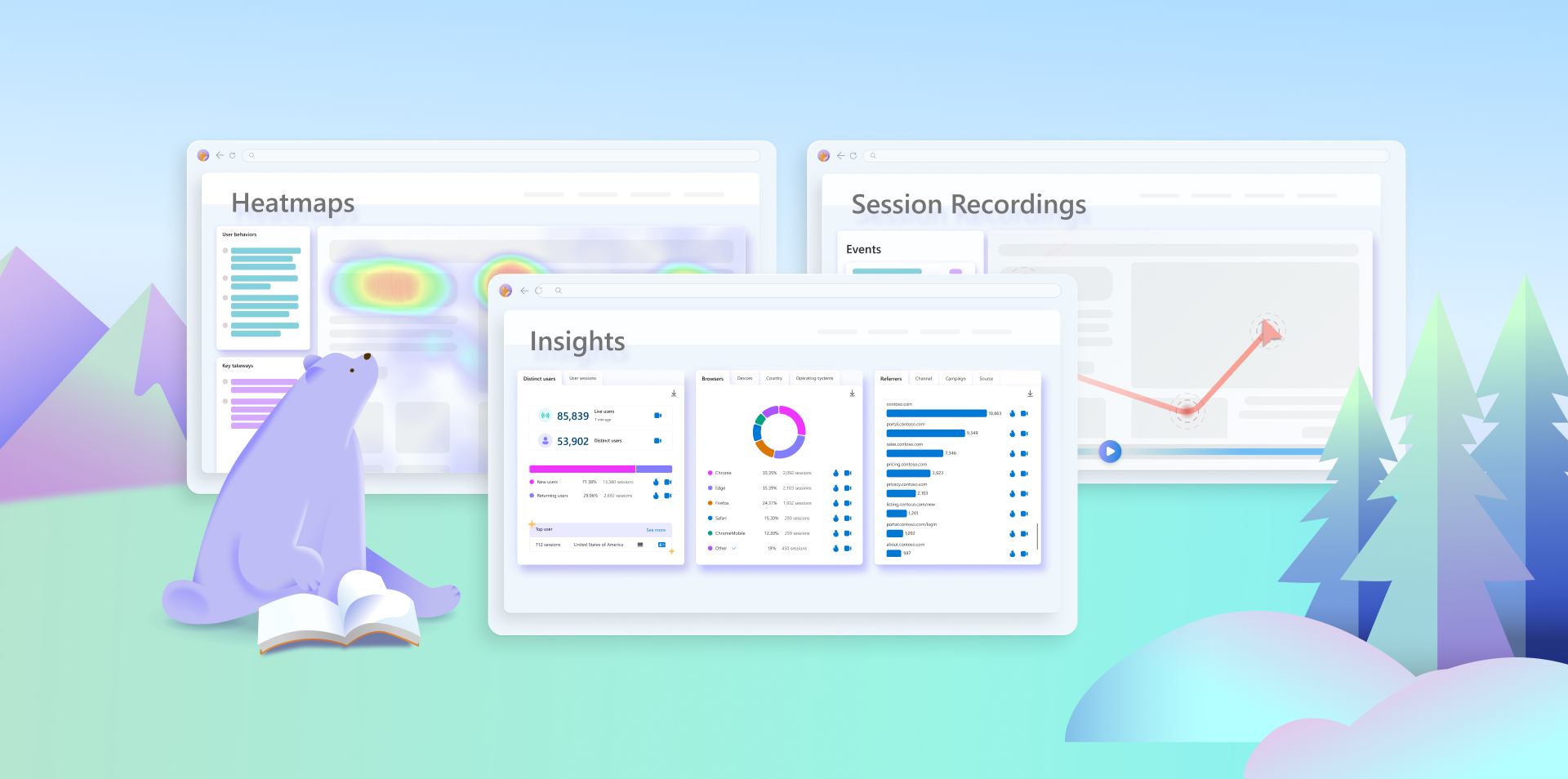
Enter Microsoft Clarity. Clarity is a free, easy-to-use, and privacy-compliant analytics tool that helps you understand how users interact with your website. Clarity provides you with rich and actionable insights that can help you optimize your conversion rate and enhance your user experience.  

In this blog post, we will show you some of the features of Clarity and how you can use them to better optimize your website for conversions.

How Does Clarity Help with CRO?

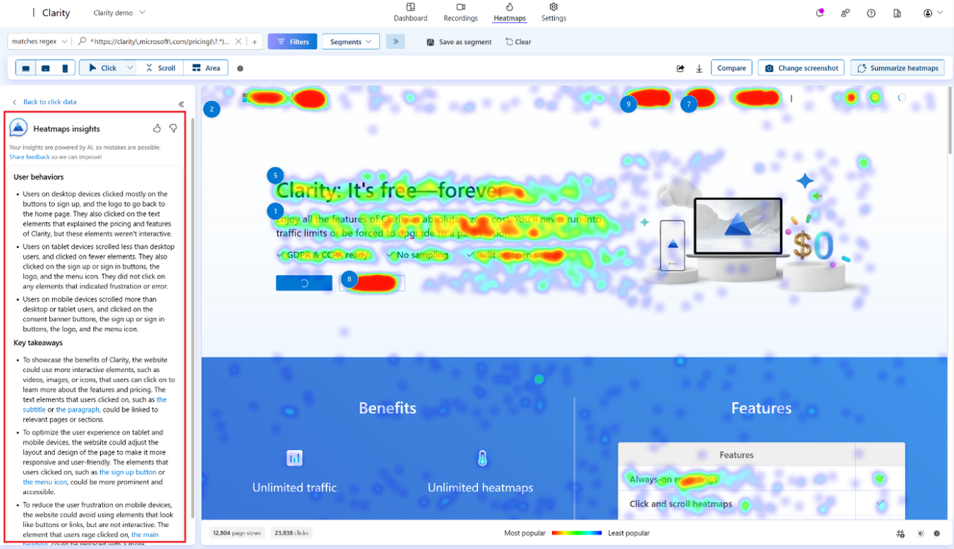
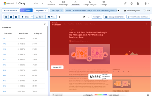
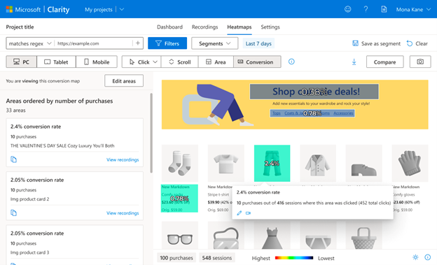
Heatmaps: Visualize User Behavior

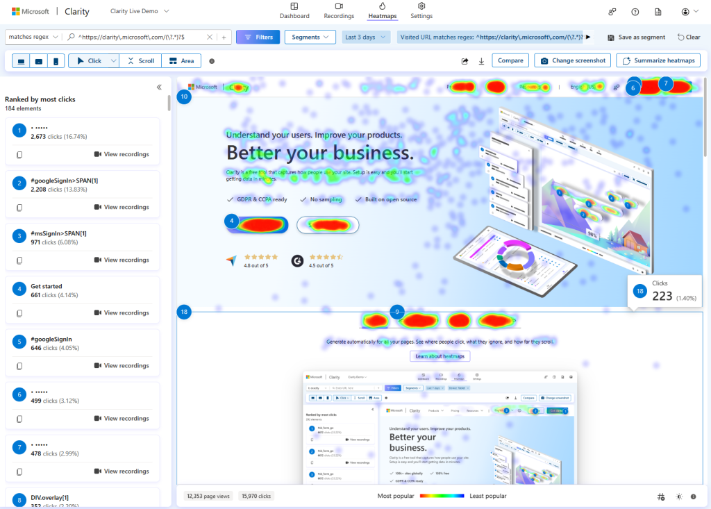
One of the most powerful features of Clarity is heatmaps. Heatmaps are visual representations of how users interact with your website, showing you where they click, scroll, and look.

Heatmaps can help you answer questions such as: 

  • Which elements on your page attract the most attention and engagement? 
  • Which elements on your page are ignored or overlooked? 
  • How far do users scroll down your page and which sections do they spend the most time on? 
  • Are there any usability issues or distractions that prevent users from completing their tasks? 

With heatmaps, you can identify the strengths and weaknesses of your website design and layout and discover opportunities to improve your conversion rate. For example, you can use heatmaps to: 

  • Optimize your call-to-action buttons by making them more visible, prominent, and appealing. 
  • Reduce clutter and noise by removing unnecessary or distracting elements. 
  • Enhance your content by adding headings, bullet points, images, or videos that capture user interest and guide them to the next step! 
  • Adjust your page length and structure by adding or removing sections based on user scrolling behavior. 

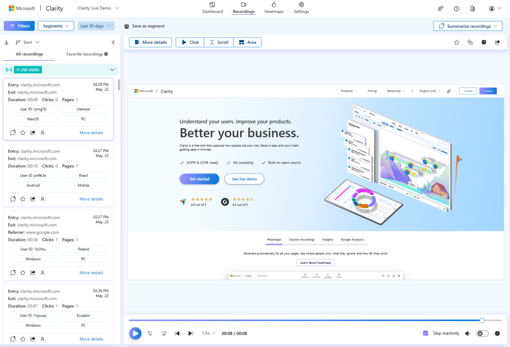
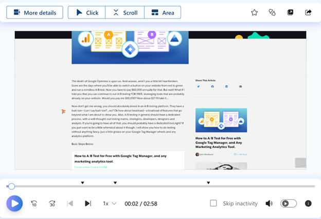
Session Recordings: Watch How Users Experience Your Website

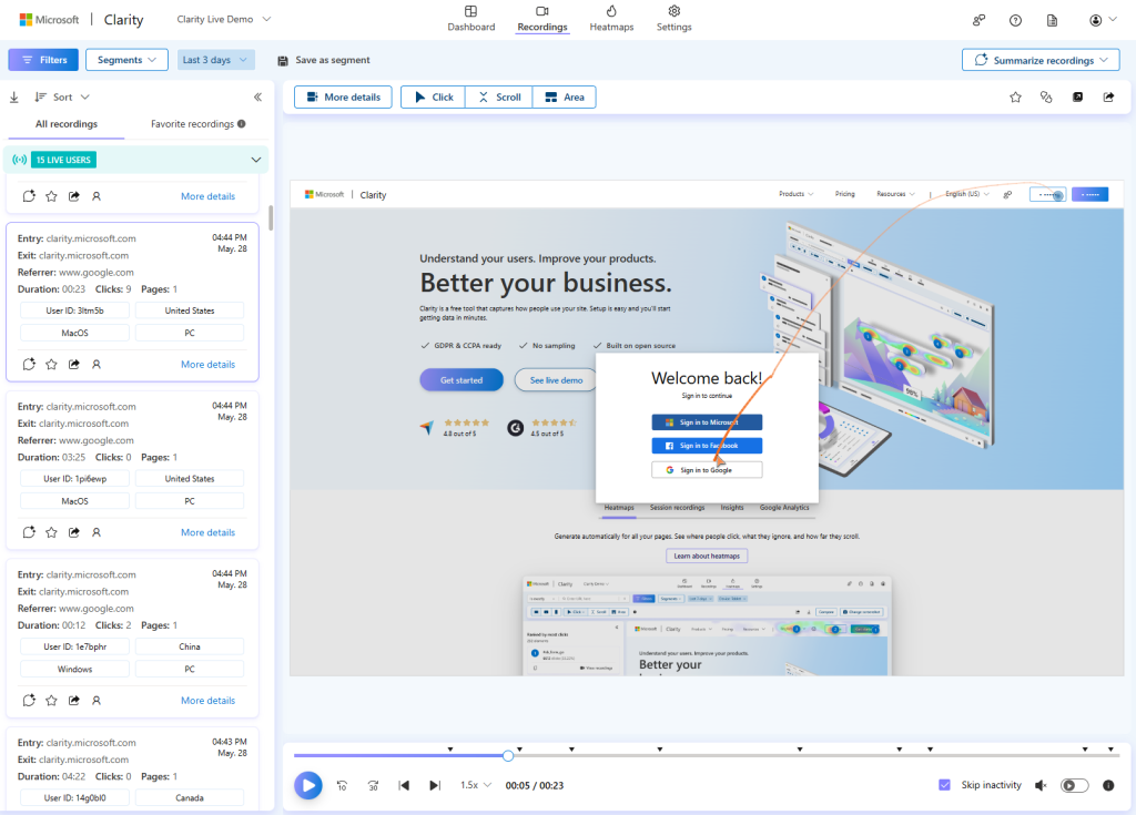
Another feature of Clarity that can help improve your conversion rate is session recordings. Session recordings are replays of individual user sessions on your website, showing you exactly what they see and do on your pages. Session recordings can help you gain a deeper understanding of user behavior, preferences and pain points, and uncover issues that might not be visible on heatmaps.  

Session recordings can help you answer questions such as: 

  • How do users navigate through your website and what path do they take to reach their goal? 
  • What are the common actions or events that trigger conversions or drop-offs? 
  • How do users interact with your forms, menus, pop-ups, or other dynamic elements? 
  • How do users react to your content, offers, or promotions? 
  • Are there any technical or performance issues that affect user experience or conversion rate? 

With session recordings, you can observe user behavior and feedback in real time and identify areas of improvement for your website. For example, you can use session recordings to: 

  • Simplify your navigation and user journey by eliminating unnecessary steps, pages, or clicks 
  • Increase your form conversions by reducing the number of fields, providing clear instructions, and validating user input 
  • Test different variations of your page elements, such as colors, fonts, images, or copy, and see how users respond to them. 
  • Fix any bugs, errors, or compatibility issues that might frustrate users or cause them to leave your website. 

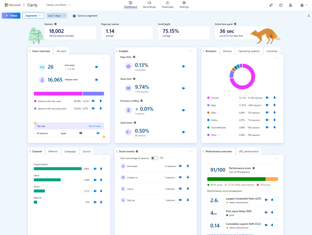
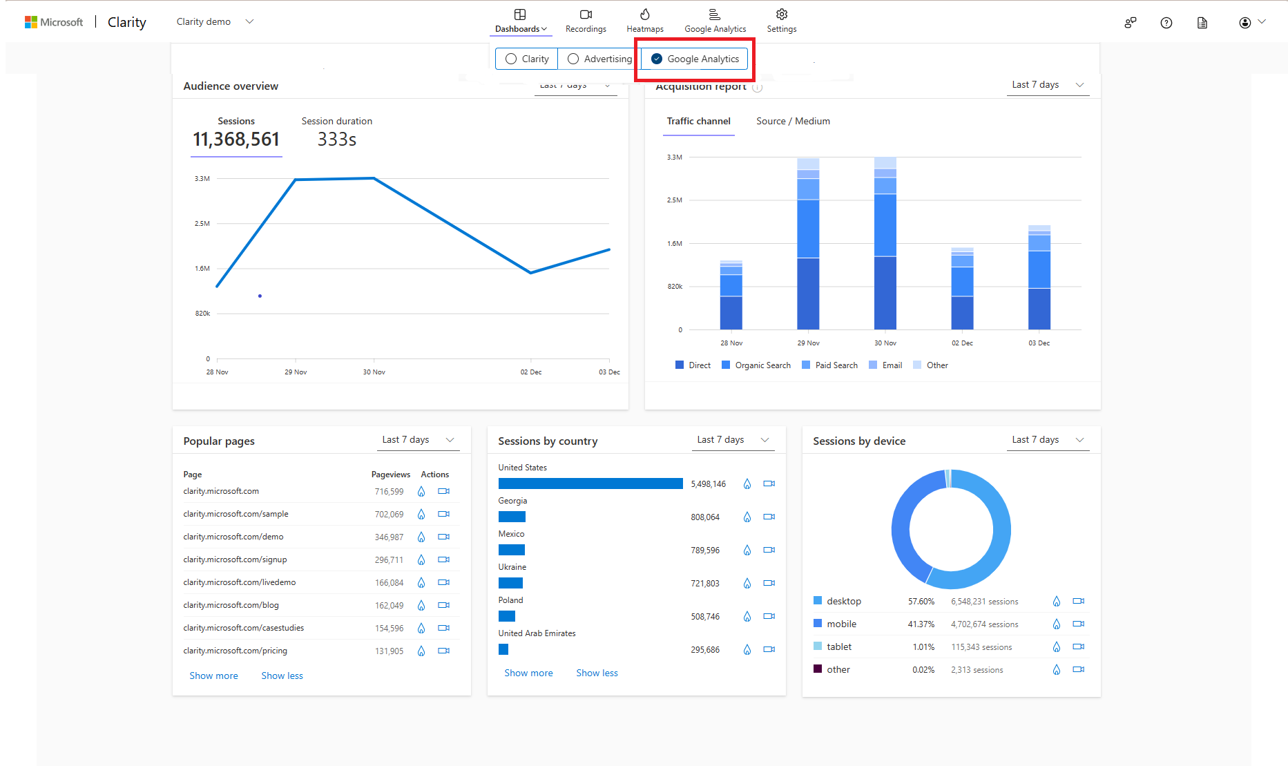
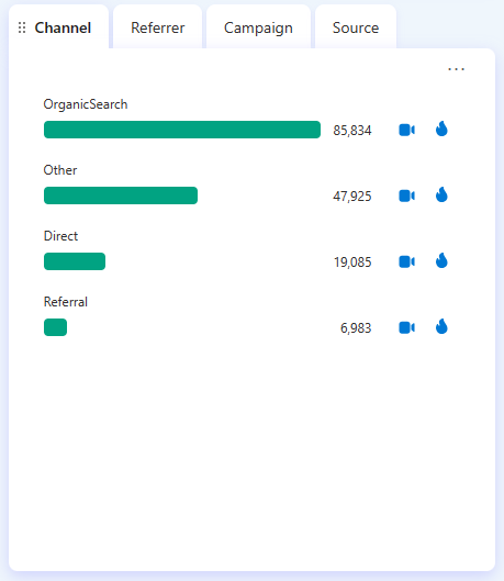
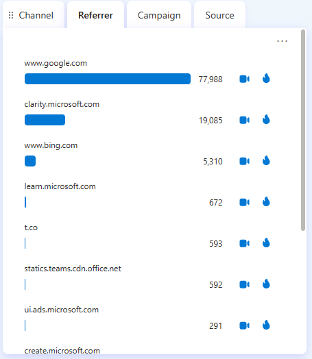
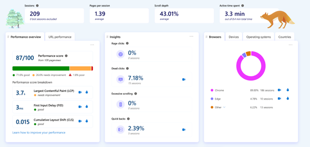
Insights Dashboard: Track Key Metrics and Trends

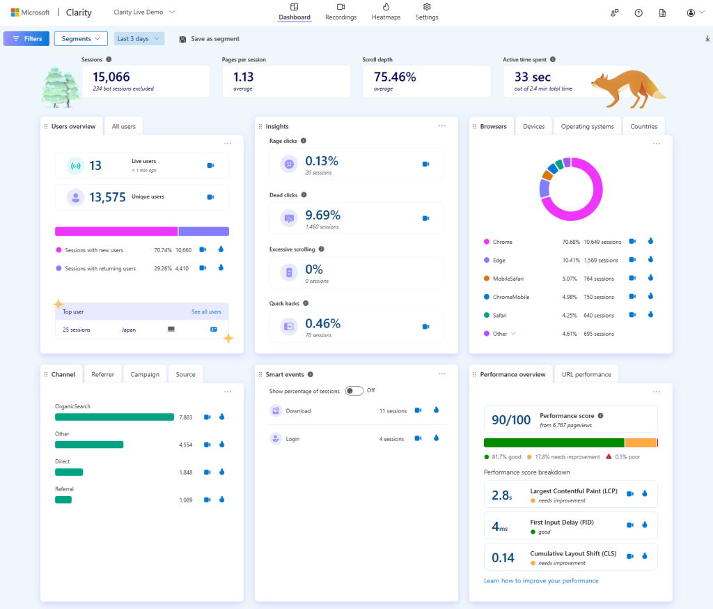
A third feature of Clarity that can help you optimize your conversion rate is the insights dashboard. The insights dashboard is a summary of key metrics and trends that show you how your website is performing and how users are engaging with it. The insights dashboard can help you track and measure your CRO efforts and get an overview of user behavior patterns and segments.

The insights dashboard can help you answer questions such as: 

  • How many visitors, sessions, and page views does your website receive, and how are they distributed over time, location, device, or browser? 
  • What is the reading behavior, scroll depth, and click distribution of your pages, and how do they vary across different segments? 
  • What are the most popular, engaging, or problematic pages on your website, and how do they affect your conversion rate? 
  • What are the most common user segments, behaviors, or interests on your website, and how can you tailor your content, design, or offers to them? 

With the insights dashboard, you can monitor and analyze your website performance and user engagement and make data-driven decisions to improve your conversion rate. For example, you can use the insights dashboard to: 

  • Optimize your website for different devices, browsers, or locations by ensuring compatibility, usability, and accessibility. 
  • Improve your page speed and performance by minimizing loading time, file size, or server requests. 
  • Segment your users and personalize your website by offering relevant, tailored and engaging content, offers, or recommendations. 

Smart Events: Defining the Conversion

Smart events automatically track important user actions on your website, such as purchases, add to cart, or form submissions—allowing you to focus on the conversions that matters most right out of the box. 

You can also create custom smart events without any code, making it accessible for users without technical expertise. This lets you define any click or page visit as a conversion which you can then track and optimize for higher conversion rates.  

Clarity presents this data in a straightforward and digestible format, making it easier to understand and act upon. This simplicity helps in quickly identifying trends and making agile decisions.

Use Clarity to Optimize your Conversion Rate 

Conversion rate optimization is a vital process for any website owner who wants to grow their business and achieve their goals. However, CRO can be challenging without the right data and tools to guide you. That’s why you should use Microsoft Clarity, a free, easy-to-use, and privacy-compliant analytics tool that helps you understand how users interact with your website. Clarity provides you with rich and actionable insights that can help you optimize your conversion rate and enhance your user experience. 

With Clarity, you can use heatmaps to visualize user behavior, session recordings to watch how users experience your website, and the insights dashboard to track key metrics and trends. By using these features, you can identify the strengths and weaknesses of your website design and layout, discover opportunities to improve your website performance and user engagement, and make data-driven decisions to improve your conversion rate. 

We were recently invited to talk about Clarity and how it helps Conversion Rate Optimization (CRO) at The CMO’s Guide to Conversion Optimization hosted by Launch. Check out our Senior Software Engineer Ahmed Osman and his talk here: AI meets behavioural analytics – Ahmed Osman, Microsoft Clarity. (youtube.com) 

Ready to get started with Clarity? Sign up for free today and see how Clarity can help you optimize your website for conversions.

How to Use Microsoft Clarity as an Alternative to GA4 

How to Use Microsoft Clarity as an Alternative to GA4 

If you are looking for a free way to analyze your website’s performance and user behavior, you might have heard of Google Analytics 4 (GA4), the latest version of Google’s analytics platform. GA4 offers features such as improved cross-device tracking, flexible event-based measurement, and integration with Google Ads. However, GA4 also has some drawbacks and limitations such as a steep learning curve, fewer reports, and data lag. 

In this blog, we will show you how to use Clarity as an alternative to GA4 and how to leverage its unique features to optimize your website and enhance your user experience. 

What is Microsoft Clarity?   

Looking for quick onboarding, simple user experience, and robust analytics? Then look no further than Microsoft Clarity. Clarity is designed to be simple, intuitive, and privacy-friendly and it works well with any website (and mobile apps too!). Clarity helps you understand how your users interact with your website. With recordings and heatmaps, you can see individual user sessions and interactions such as clicks, scrolls, mouse movements, and more. 

Can I Use Clarity with Google Analytics?   

By using both tools together, you can get a complete and holistic understanding of your both your website and your users. Use GA4 to get a high-level overview of your website’s performance, and then use Clarity to drill down into the user behavior. Clarity provides data on how users navigate and engage with your website. This way, you can uncover issues and opportunities that you might miss if you only use one tool.

Can I Use Clarity as GA4 Replacement? 

Here are some ways to use Clarity as an alternative to GA4: 

Simple Reports of GA Data: One of the challenges of using GA4 is that it has a different and more complex reporting structure than the previous versions of Google Analytics.

For example, GA4 uses a new concept of analysis modules, which are customizable reports that allow you to create different combinations of dimensions, metrics, segments, and filters. While this can be powerful and flexible, it can also be confusing and overwhelming for many users. 

Clarity, on the other hand, has a simpler and more intuitive interface that allows you to easily access and visualize your GA data.  

GA Dashboard.

Additionally, you can use the Clarity dashboard to get additional traffic, engagement, and conversion metrics such as popular pages, scroll depth, rage clicks, and other user frustration metrics. If you value live data, Clarity provides a live user count, and all other metrics are available in the dashboard within minutes. No more waiting hours or even days to dive into your data.

Source Referred Traffic: Another benefit of using Clarity as an alternative to GA4 is that it can help you identify and analyze your source referred traffic, which is the traffic that comes from other websites or platforms that link to your website.  

In GA4 it can be difficult to find and filter by this, especially if you have multiple domains or subdomains. Clarity, on the other hand, makes it easy to see and segment your source referred traffic, as it automatically tags and groups your traffic by the referring source, such as search engines, social media, email, or other websites.  

You can also watch the recordings and heatmaps of the user sessions that came from each source. This allows you to understand how your source referred traffic behaves and converts on your website and therefore how to better optimize your website according to your goals. 

User Behavior Insights: One of the unique features of Clarity that GA4 does not offer is the ability to view actual user sessions and interaction data on your website. Recordings and heatmaps are two of the most powerful tools that Clarity provides, as they allow you to see how your users navigate and engage with your website, rather than just relying on aggregated metrics and numbers.  

You can use the recordings and heatmaps to see where your users click, move their mouse, and type on your website, as well as how long they stay on each page, and what causes them to leave or convert. Filtering and segmentation of your recordings and heatmaps by various filters, such as device, source, location and behavior allow you to identify and analyze user patterns, preferences, pain points, and opportunities allowing you to optimize your website accordingly.


We are constantly listening to user feedback so keep an eye out for future updates around this topic! Check out our blog and case study page for more examples and use cases on how others have used Clarity in the real world. 

Microsoft Clarity’s Copilot: AI-driven session replays 

Microsoft Clarity’s Copilot: AI-driven session replays 

Ever wish you could read the minds of your website visitors, know how they use your site, and figure out what really makes them convert? 

While that dream isn’t yet reality, Microsoft Clarity’s heat mapping tool offers one of the closest technologies yet to help you achieve this goal. 

It lets you visualize data so you can better understand how visitors interact and behave on your site. 

Yet, while heatmapping data can paint a rich and colorful picture of what visitors engage with on your site, and what they might be missing, it doesn’t show the full story. 

To really understand what your users are doing, you need to watch them. 

Step in session replays. 

What are session replays, and why are they important? 

Session replays are video recordings of each individual user’s web session. 

The recordings reveal how your actual web visitors are navigating your website and interacting with the elements on your pages. 

Through watching session replays, it’s like you can step into the minds of your users and witness their every click, scroll, and interaction. 

But the recordings can offer more than just a glimpse into the virtual footsteps of your audience. They can be the key to unlocking a treasure trove of insights to users and how they behavior on your site. 

In fact, according to some research, 99,174 of the world’s top 1 million websites use session recordings to answer questions such as: 

  • Where do our users get frustrated? 
  • Where do users quit in the funnel? 
  • How do users interact with an onboarding sequence? 

By asking yourself these same questions, and evaluating the session reply data, you can extract valuable insights that let plug leaks and reduce the friction in your conversion funnel. 

The problem with session replays 

While session replays add incredible arsenal to an experimenter’s toolkit, they do have a drawback: they’re extremely time consuming to take in. 

Even though you can play them back at 12X speed, and filter the playbacks to monitor only specific visitor actions, it can still take hours or days to get through each video replay. 

One-by-one, you need to watch mouse movements, observe button clicks, make mental notes, write down observations, and formulate trends. 

The process is both tedious and mentally taxing! 

It seems there’s got to be a better way. . . 

AI-generated insights in a flash 

Imagine being able to harness AI to effortlessly generate session replay summaries? 

With Copilot in Microsoft Clarity, this dream is now a reality! 

By using AI-driven algorithms, Copilot identifies user patterns, frustrations, and engagement highs and lows.  

Copilot’s natural language summaries distill complex session data into concise, actionable takeaways, eliminating the need to sift through hours of recordings. 

Using Copilot is equally as easy as generating robust insights from it. 

Within Microsoft Clarity, simply click on the Recordings tab, then go to the left side of the screen, where All recordings are listed. Then, go into any single recording and hit the plus talk bubble icon

Within seconds, Copilot – which is integrated with ChatGTP – will immediately create a detailed summary of the actions the user took, hitting all the key points. 

In an instant, you’re given everything needed to understand how the user behaved and why. Your bullet point summary will looking something like this: 

Which means that, within seconds – not hours or days – you’re now able to make informed data-driven decisions without needing to decipher reams of intricate data. 

So you can say goodbye to labor-intensive manual analysis and welcome a new era of efficient, time-saving optimization. 

Data you can trust, literally 

While Copilot pushes the boundaries of innovation, you can also rest easy knowing that the data it provides is truly trustworthy. 

Like all of Microsoft Clarity, Copilot is built within a framework of trust and security. The data you’ll get is both GDPR and CCPA compliant.  

This data protection ensures your session replay, and AI-generated insights, are not only productive but also ethically sound. 

Using Clarity’s Copilot tool to enhance your productivity 

Microsoft Clarity’s Copilot isn’t just a tool; it’s a game-changing addition to heatmapping optimization.  

By leveraging AI-generated session insights, you’re not only saving yourself the tedious, time-consuming task of combing through mounds of session replays, you’re also optimizing your optimization process! 

To learn more about Microsoft Clarity’s Copilot feature, checkout this article and get started on Microsoft Clarity which is free, forever. 


Deborah O’Malley is a top A/B testing influencer and recognized as a leading women CRO specialist. 

She’s the founder of GuessTheTest, an experimentation resource dedicated to sharing A/B test case study knowledge and insights. Turing theory into practice, she runs the optimization agency, ConvertExperts, where she helps clients test and optimize their sites. 

A published author of six peer-reviewed journal articles, Deborah also teaches analytics at Queen’s University’s prestigious business school. 

When not out speaking about experimentation, Deborah can be found in the kitchen making homemade fudge or burning it off at the gym. 

The Quick Guide to Microsoft Clarity’s Copilot

The Quick Guide to Microsoft Clarity’s Copilot

If you’re ready to streamline your data analysis and boost productivity, then you’ve come to the right place! In this guide, we’ll dive into the ins and outs of Copilot in Clarity -empowering you to navigate the features with ease and confidence.  

A bit of context

To understand our Copilot features, it helps to understand first what Microsoft Clarity is.

If you’re new to Microsoft Clarity, welcome! We are a free behavioral analytics tool, helping you optimize your website by understanding your site visitors. What journey do they follow on your site? What parts do they love? What pages do they have trouble on? We offer session recordings, heatmaps and insights to help you understand pain points and opportunities. Did we mention we’re free

Introduction to Copilot in Clarity

To make data analysis easier and faster for you, we’ve built a suite of Copilot features to help you skip directly to the important info. These features all incorporate generative AI through Large Language Models (LLMs), the same technology that underpins ChatGPT. Let’s check them out! 

1. Chat with Copilot

Copilot helps you better understand your project data. Using Generative AI, Copilot provides instant, easy-to-understand answers to your dashboard questions. Simply click the icon in the top right to get started! 

2. Session Insights

Session insights, powered by Copilot, quickly summarize session recordings for you. Instead of manually watching countless long recordings, just use Session insights to understand the recording within seconds. 

To use it, simply click on the Summarize icon in the individual recording: 

For more information, visit our documentation here

3. Grouped Session insights 

Our next Copilot-powered feature is Grouped Session insights, which summarize multiple session recordings at a time. This feature allows you to extract key patterns at a glance and pinpoint the recordings that are worth watching. 

To use it, simply click on the Summarize icon on the top right of the Recordings panel. Pro tip: if you have a specific segment of users you’d like to summarize, filter to that group first and select the “Top 10 recordings” option.  

For more information, visit our documentation here

4. Heatmap insights

Heatmap insights allow you to summarize across multiple heatmaps for a website page. In other words, given a page URL, Copilot parses through the click and scroll heatmaps across all three devices for that URL and outputs a descriptive summary. This means you get a more complete understanding of the aggregated user behavior of a website page in seconds.  

To use it, simply click on the Summarize button in the top right corner of the Heatmaps tab.  

For more information, view the documentation here.  

Conclusion

Our mission with Clarity is to make behavioral analytics more accessible for everyone, even non-technical folks. When we roll out Copilot features, our aim is to make the latest generative AI technologies available for everyone and contribute to faster, easier analytics. Stay tuned as we roll out more Copilot features in the coming weeks! 

If you have feedback to share on this guide or our Copilot features, tweet us @msftclarity or contact our Support team. We’d love to hear from you! 

Unlocking Ecommerce Success: 10 Strategies to Boost Purchases with Behavior Analytics

Unlocking Ecommerce Success: 10 Strategies to Boost Purchases with Behavior Analytics

I’m going to ask an easy question. What’s the point of an online store? 

Well, on the surface, there’s a simple answer: to sell products. But underneath that statement, there’s a whole world of complexity that comes with the second goal of “providing a positive experience for your customers.” There are countless touch points along the way that could prevent people from purchasing from your online store. Imagine you have a physical store, and when a customer comes in to buy some cheese, they find that the cheese is on the top shelf, and they need a ladder to climb up and get to it. Sounds like that person is not going to buy that cheese, right? Maybe 1 in 30 will find an employee and ask for a ladder, but most likely, that person is going home without cheese. On the web, there are so many friction points that prevent users from having a positive experience and buying your cheese (or whatever you sell). The good news? There are amazing tools out there that provide insights into these friction areas, so that you can identify and ultimately solve many of the issues that are preventing users from purchasing. 

And that’s what we are going to talk about today. Here are 10 strategies on how to use behavior analytics to enhance a user’s experience on your online store and, therefore, optimize your sales. 

Utilize Heatmaps to Understand What People See and What They Don’t 

In your imaginary physical store, would you put some awesome product information in the very back? Probably not. Companies invest a LOT of time into content and specific elements on their site, assuming that these will help provide information or interaction to increase the likelihood of conversion. The problem is that oftentimes, people don’t see a lot of it. While every website is different, there is generally a drop-off effect the further down your content is on the page. Imagine someone having to scroll to get a look at your products; you can bet that there will be significantly fewer clicks to cart compared to if that person saw the product right away. To understand what people are actually seeing, you can utilize heatmaps to identify which areas of your website attract the most attention and which ones are being overlooked. You can then use this information to optimize your layout and content placement on the page. 

Optimize Load Times 

Let’s say a person arrives at your imaginary cheese store and sees the line is out the door. They might suck it up and wait in line to get their super bowl party cheese platter rather than driving across town to a different cheese store. The switching costs are higher. It takes a lot of effort to go to a competitor at this point. On the web, it’s totally different. Your users could leave and be at your competitors with only a couple clicks…the longer your site takes to load, the more likely that user is going to bounce and look at competitors. Luckily, you can analyze page load times to ensure a seamless user experience. Tools such as Microsoft Clarity and Google’s PageSpeed Insights can give you metrics on speed and help identify and address any bottlenecks that may be causing slow loading speeds, as this can significantly impact conversion rates. 

Identify Valuable Elements 

Oftentimes, sites include an overwhelming amount of content areas & elements that they assume are valuable for the customer on the pathway to conversion. However, it can be hard to distinguish what’s actually valuable and what’s just noise. Purchase conversion heatmaps  can help identify which areas are genuinely interacted with or seen on the pathway to conversion. By focusing on enhancing these elements, you can encourage more interaction and conversions, ensuring that your efforts are directed towards the most impactful aspects of your site. 

Pinpoint Drop-off Points with Funnels 

Let’s face it, every site has problems, whether you want to admit it or not. It’s okay; I’m not here to judge you on your sub-ideal checkout funnel. However, what I will judge you on is if you simply accept that it could be better and just twiddle your thumbs doing nothing about it. Funnels can help you identify which parts of the website need improvement and where the largest friction points are. Set up funnels to track the user journey through your website, from landing to purchase. By identifying the points where visitors are most likely to drop off, you can focus on improving those areas to increase conversion rates and create a more seamless user experience. 

Find and Resolve Friction with Click Behavior 

I just think the phrase “rage click” is too funny. It’s the equivalent of someone coming into your physical store and punching and kicking the shelves out of frustration. Can you imagine that? While that might be a bit hyperbolic of the situation, the same idea applies to your website. People get frustrated when they think they should be able to do something but can’t. This frustration not only hurts your reputation but also your sales. Fortunately, heatmap tools and session recordings can help you identify where people are having extremely negative experiences on your site, allowing you to fix these issues. By analyzing click behavior, you can pinpoint areas of friction or confusion on your website. Use this information to streamline the user experience and make it easier for visitors to navigate and complete purchases, ultimately reducing those “rage clicks” and boosting customer satisfaction. 

Leverage Session Recordings for Insights 

Watching what happens during a visit can help you identify a user’s experience. The problem, though, is that to truly identify patterns, you’d have to watch a ton of recordings, and no one wants to sit there for hours watching countless sessions (or maybe you do, but you should probably just keep that to yourself). The good news is that Microsoft Clarity offers a feature called CoPilot, which allows you to grab as many sessions as you want and have AI go through and summarize them for you. By segmenting the data with filters, you have a pretty powerful experience identifier at your fingertips. You can watch these session recordings to gain a deeper understanding of how users interact with your website, identifying common patterns, struggles, and opportunities for improvement based on real user behavior. This invaluable insight can help you make data-driven decisions to optimize your site and create a more user-friendly experience. 

Segment Your Audience for Targeted Optimization 

Picture this: a group of Girl Scouts and a group of motorcycle enthusiasts walk into your store. They’re probably going to shop very differently (though there might be some surprising overlaps—I’ll let you figure out what those could be). Identifying user segments through behavior analytics allows you to understand patterns based on factors such as user type, device type, and referral source. First-party data gathering techniques, such as quizzes and surveys, can help you capture information, while CDPs (Customer Data Platforms) can help retain and leverage that data. Tie that into your experience analytics tool, and you can have a much better sense of how specific groups are using the site. By tailoring your optimization efforts to each segment, you can create a more personalized and effective user experience. The more customized the experience, the more likely visitors are to convert. So, whether you’re dealing with cookie pushers, leather-wearing daredevils, or those who identify with both(!), segmenting your audience and delivering targeted experiences can make a world of difference in your conversion rates. 

Conduct A/B Testing 

We all have our pride and opinions, and sometimes we make guesses about what changes to our site will move the needle. But let’s be real, this practice can lead to plummeting conversion rates and a whole lot of wasted time and effort. That’s where A/B testing comes in—a wonderful tool to help you separate truth from mere speculation. Don’t just guess; learn with data! Utilize A/B testing, with tools like Convert.com, Optimizely, or AB Tasty to experiment with different versions of your website elements, such as call-to-action buttons, product descriptions, and layouts. Then, use behavior analytics to determine which variations drive the most engagement and conversions. By letting the data do the talking, you can make informed decisions that will keep your conversion rates soaring and your time invested wisely. 

Integrate with Other Tools for Holistic Insights 

Don’t you just love saying the word “stack”? Besides being fun to say, having an analytics stack can be crucial for your business. Different platforms offer different advantages, and by combining them, you can gain a comprehensive understanding of your users’ journey. Marketing analytics tools (such as GA4 or Piwik PRO) can provide detailed information about where people come from and how they arrived at your website. When combined with behavior analytics, this data can paint a broader picture of the user journey. But wait, there’s more! Mix in Customer Data Platforms like Segment, and you can start to truly understand an entire user’s lifetime value to your business. Use these insights to make data-driven decisions and create a cohesive marketing optimization strategy. 

Continuously Monitor and Adapt 

“Nothing lasts forever” and “a picture is worth a thousand words”—these two phrases pretty much sum up this point. In the digital world, you can’t just set it and forget it. Digital trends are constantly evolving, and if you don’t keep up, you might end up like Blockbuster (DON’T BE BLOCKBUSTER). To stay ahead of the game, build visualizations that allow you to regularly review your behavior analytics data. This way, you can keep your finger on the pulse of changing user preferences and trends, and quickly see what matters most. By continuously adapting your strategies based on the insights you gain, you’ll be ensuring ongoing success. Think of it as a never-ending cycle of improvement—kind of like your daily skincare routine, but for your website (more lotion, don’t let it dry out!). Continuously adapt your strategies based on the insights gained to ensure ongoing success. 

Implementing these 10 strategies and leveraging behavior analytics tools will help ecommerce websites’ performance and sales thrive. By diving deep into user behavior, identifying those annoying friction points, and continuously optimizing your site, you’ll be creating a powerful experience that turns users into customers.  Remember, the ecommerce landscape is constantly evolving, so it’s crucial to stay agile and adapt your strategies based on the insights gained from behavior analytics.  Continue to invest in enhancing the experience for your customers and you will see continued success! (unlike Blockbuster…poor Blockbuster).  


About the author

Josh Silverbauer is a highly accomplished analytics and conversion rate optimization (CRO) expert, known for his ability to combine complex analytics concepts with music & humor…With over 10 years of experience, he has consulted with some of the world’s largest brands, and has spoken at major events like SXSW & MeasureSummit. Josh is currently the Head of Analytics and CRO at From The Future, a CX & performance growth agency, and previously served as CEO of Great Big Digital Agency for 6 years.